VIEW SITE
View EXPERIENCE GUIDELINES
PROJECT
Better Therapeutics (previously called FareWell) is a digitally enabled dietary-lifestyle program designed to prevent and reverse weight-related disease. This is done by integrating behavioral science with the power of whole plant foods to help individuals shed the weight and bad eating habits, for good.
We designed a digital system for Better Therapeutics that provides the tools, knowledge and expert support through a deliberately designed program to change dietary behavior for results that last a lifetime. Losing weight is a journey, better health is the outcome.
ROLE
1. Service Design
2. Identity Design
3. Product Design
4. Marketing Design
5. Creative Direction
Designing a digital system that inspires and supports users for a long term positive behavior change.
Aid culinary literacy and accountability. Provide a design language that speaks to the beauty that lies in healthy food.
Design should build perception of a credibile, expert guided health service product.
User should feel inspired, energized & find the experience fun and light- hearted.
Behavior change is hardest when it comes to food. Process was powered by proven behavior change model.
Iterative feature development for solid product definition.
Testing process designed to collect credible health data, proving positive outcomes for investors as well as the FDA.
Enabling culinary literacy through visual representation of ingredients. Extreme attention to beauty to excite users to eat healthy food.
Extensive design system for longevity of design work across all digital platforms.
Launching a holistic web app with all marketing collateral and a website.
Securing second round of funding of $7.5M.
Remarkable positive health benefits to different users who went through different programs.
Native app was built following the web app success.
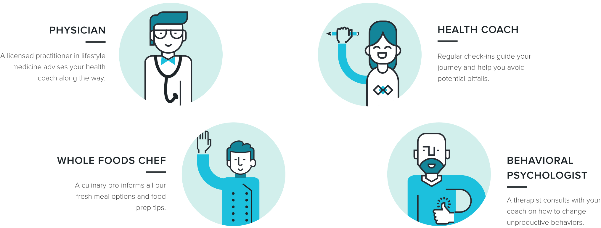
Web app that encompassed inputs and results for all different professionals involved in the process- physicians, health coaches, whole food chefs, behavioral psychologists.

KEY ANCHOR 01
Identifying the Behavior Change Model for Positive Long-Term Improvement
Along with experienced behavior change specialists in the advisory team, we worked very closely with Dr Mark Berman, Head of Health. Human behavior can be viewed through many valid lenses. There is no unified behavior change theory.?Instead, many validated and overlapping models and constructs exist. A lot of models were studied in depth- Social Cognitive Theory, BJ Fogg, Theory of Planned Behavior, Health Belief Model, Pressure System Model, Self Affirmation Theory, etc
MOTIVATION- RESISTANCE = CHANGE

Several variables influence process of change

a.
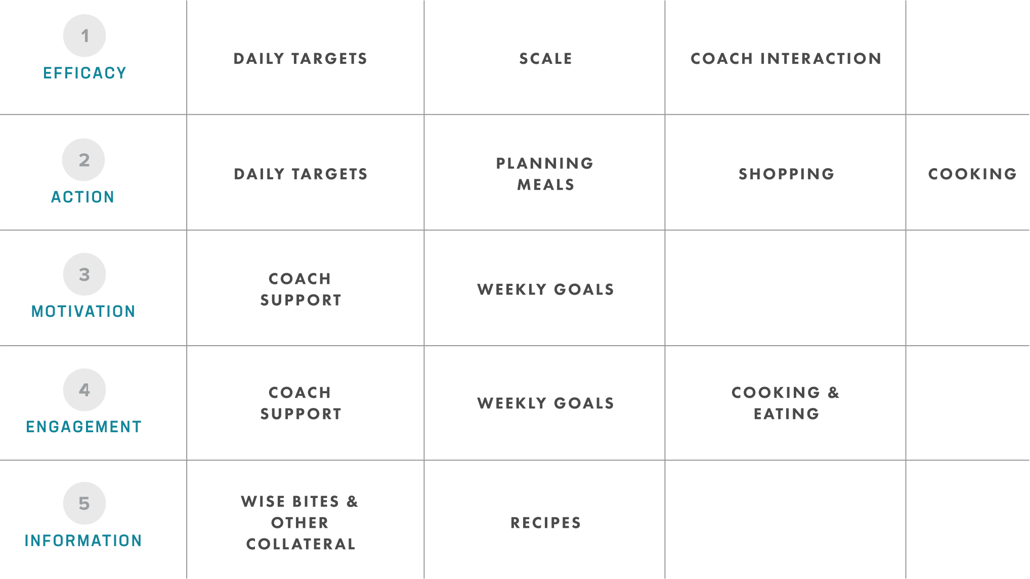
MAPPING FEATURES TO BEHAVIOR CHANGE ATTRRIBUTES
b.
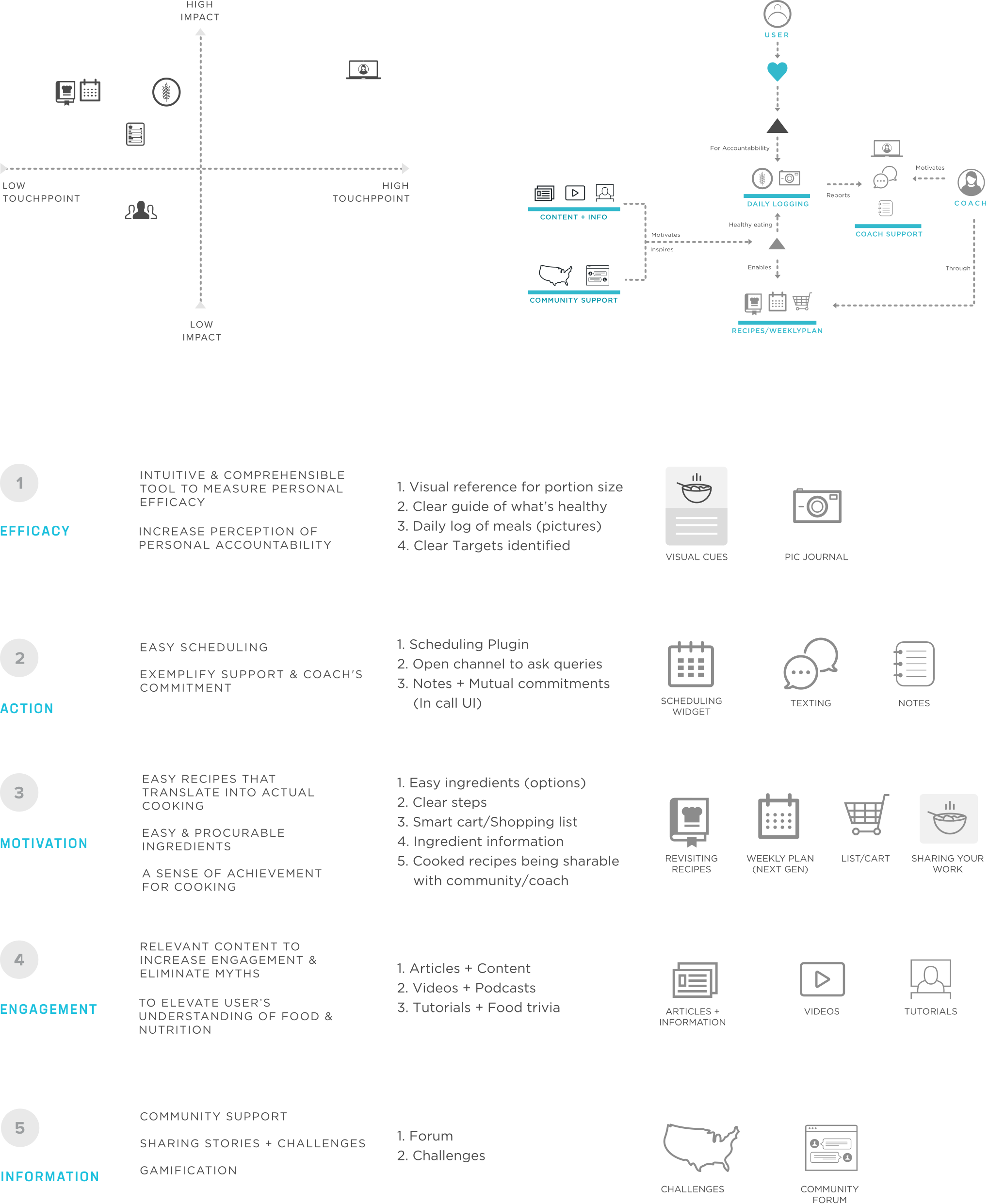
FEATURE PRIORITISATION

KEY ANCHOR 02
ANCHORING BEHAVIOR CHANGE ON SPECIFIC FEATURE SETS: ENABLING HEALTH MANAGEMENT EASY & ACTIONABLE
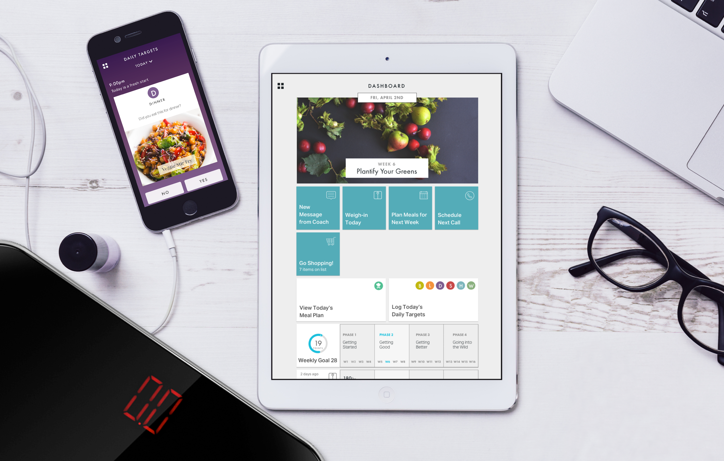
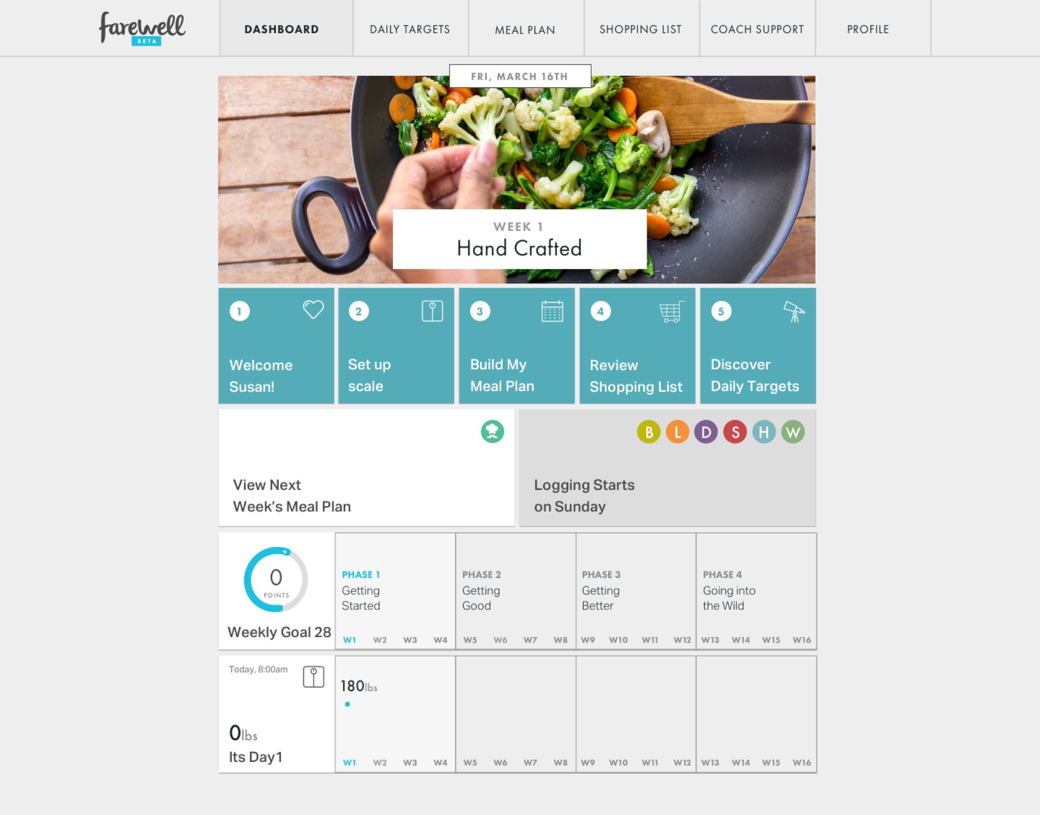
Beter Therapeutics came to us with a very large vision. For achieving the desired business and mission objectives, we proposed a framework to match the features to the change attributes. Making sure that all the attributes are well servied with at least one feature. Product offerings were then mapped into a system to show how they would all work together in an ecosystem. Both in and out of the app.
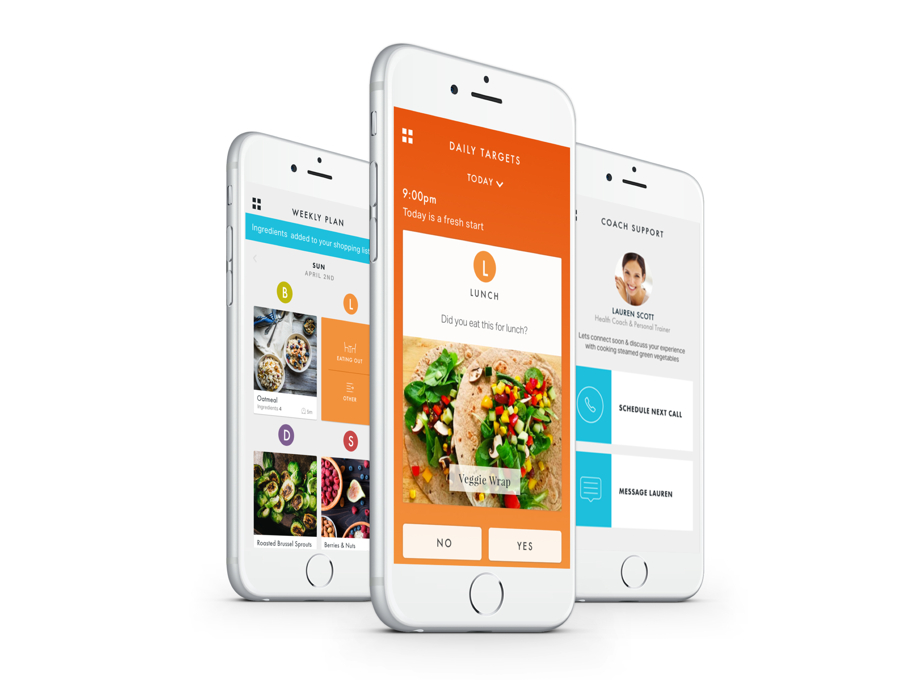
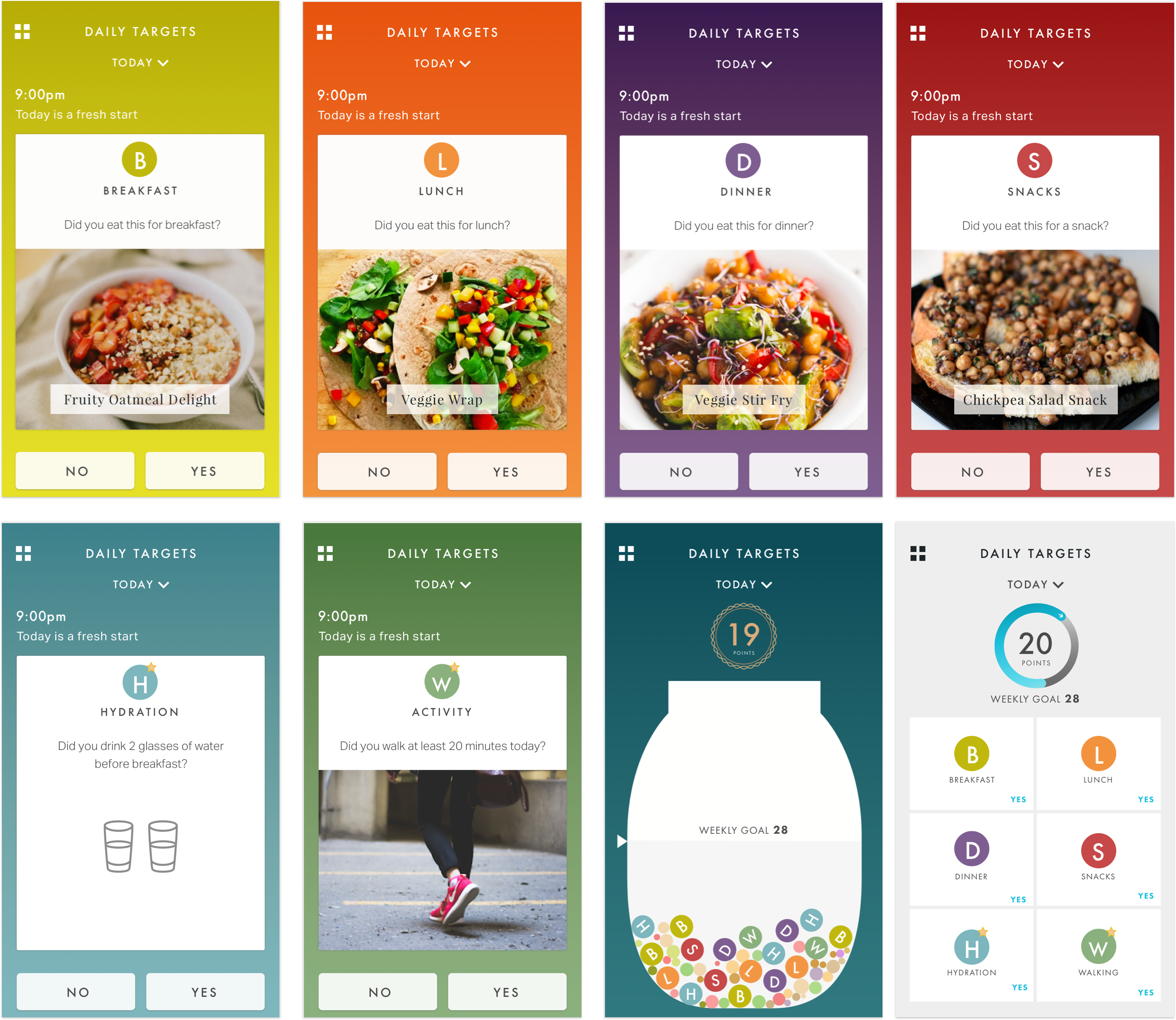
DAILY TARGETS
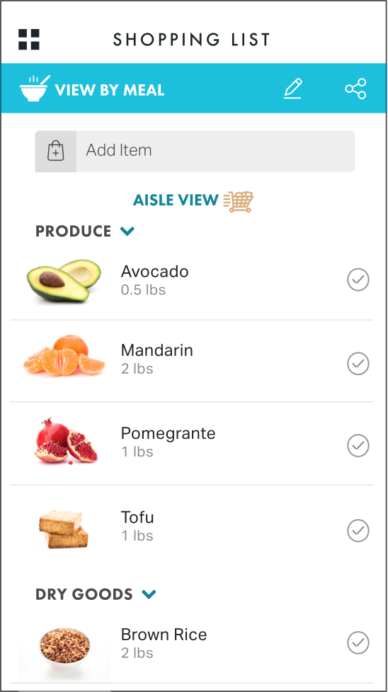
MEAL PLANNING & SHOPPING LIST
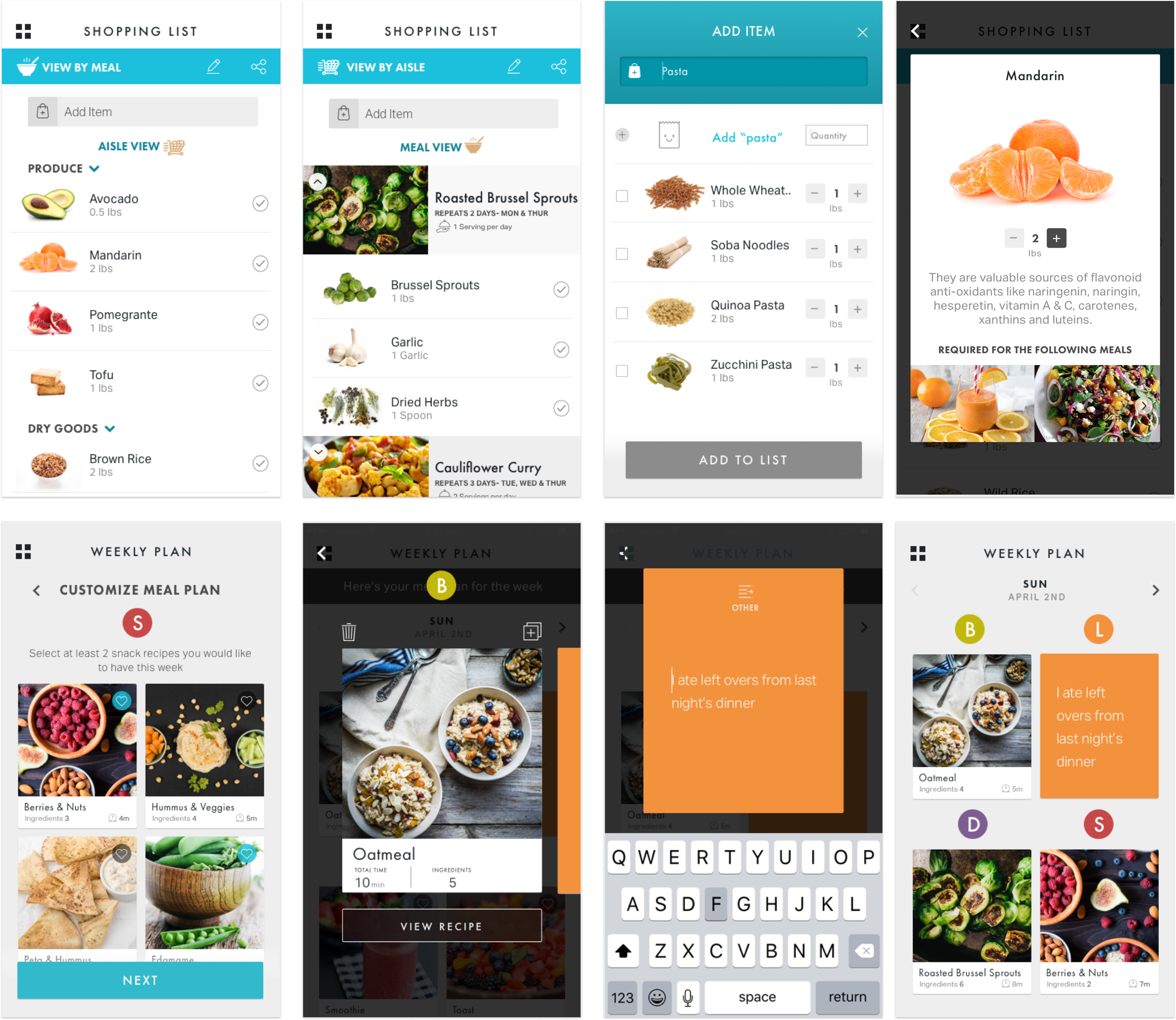
DASHBOARD

KEY ANCHOR 03
Inspirational content & visual design to propel positive actions
FareWell came to us with a very large vision. For achieving the desired business and mission objectives, we proposed a framework to match the features to the change attributes. Making sure that all the attributes are well servied with at least one feature. Product offerings were then mapped into a system to show how they would all work together in an ecosystem. Both in and out of the app.

INSPIRING IMAGERY & DESIGN ELEMENTS
Different page types were created in the code based on the content requirements. This system Modular design-code frame-work would enable

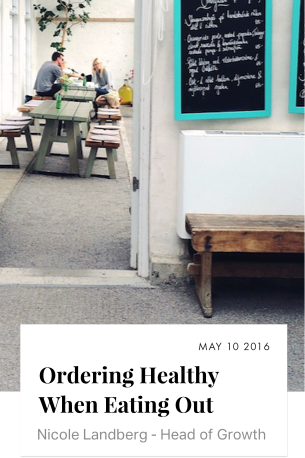
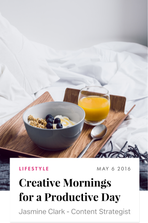

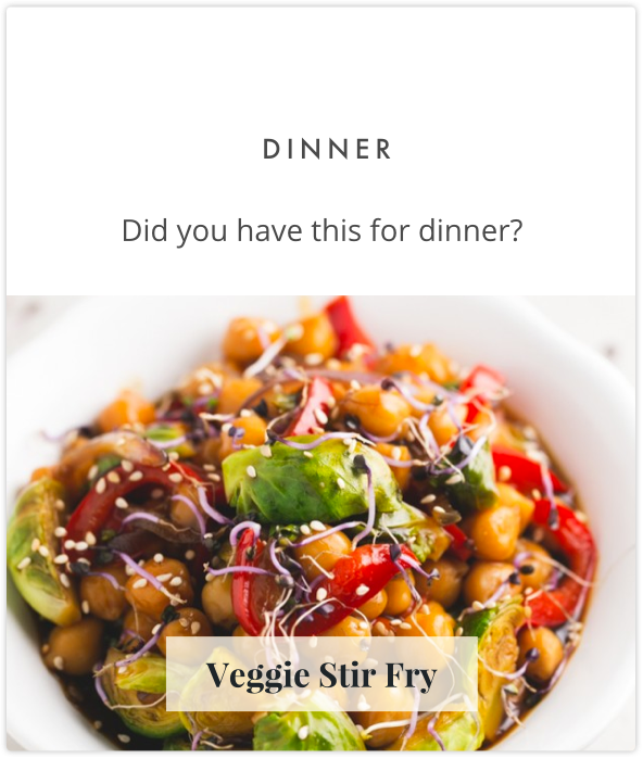
HANDPICKED, EDITED FOOD IMAGERY FOR CLARITY & IMPROVING CULINARY LITERACY
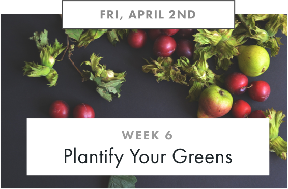
In order to serve the objective of culinary literacy, there was a heavy emphasis on visual learning of ingredients. Additionally, prepared food recipe images were hand picked to incentivise the users to cook and eat healthy yummy wholesome food.
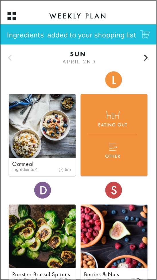
Daily Target Cards
Quick Browse
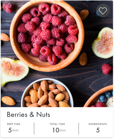
Smaller Cards
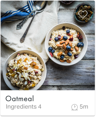
Dashboard Weekly THEME Card
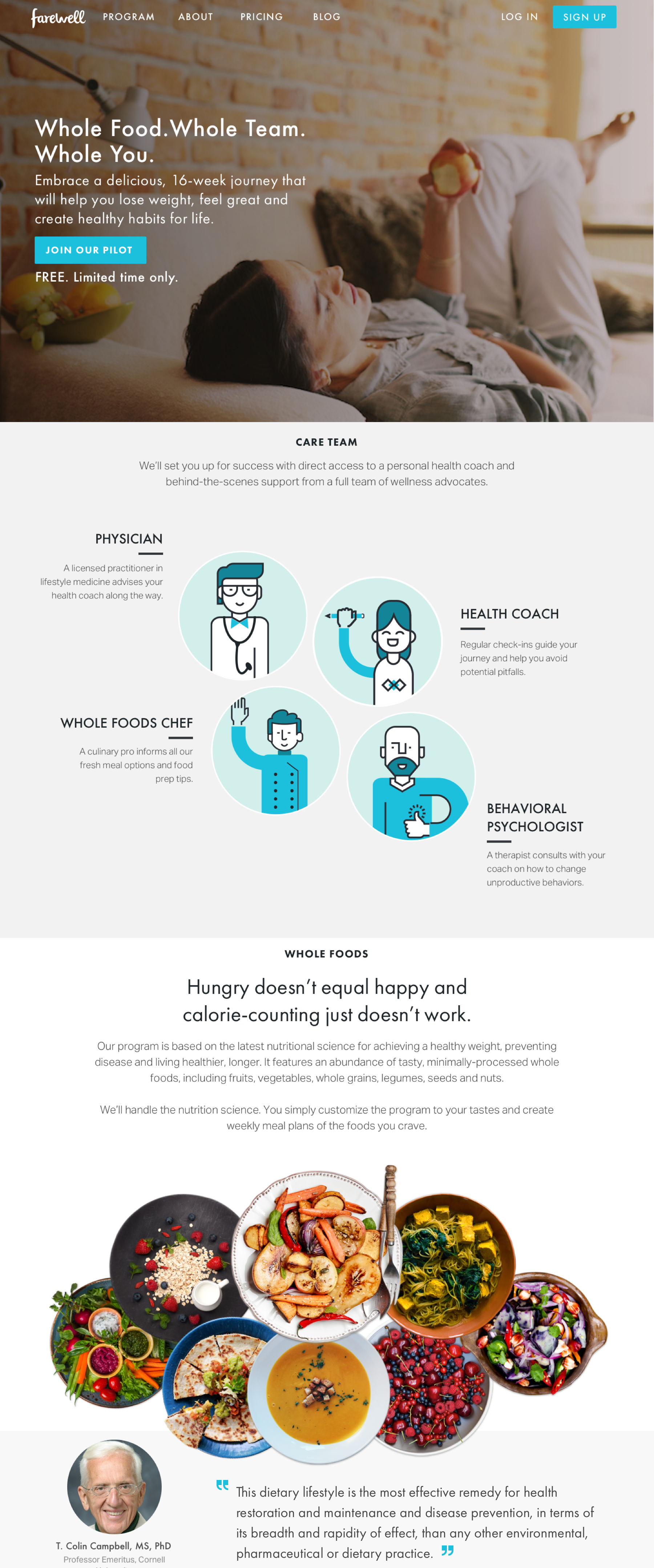
MARKETING WEBSITE

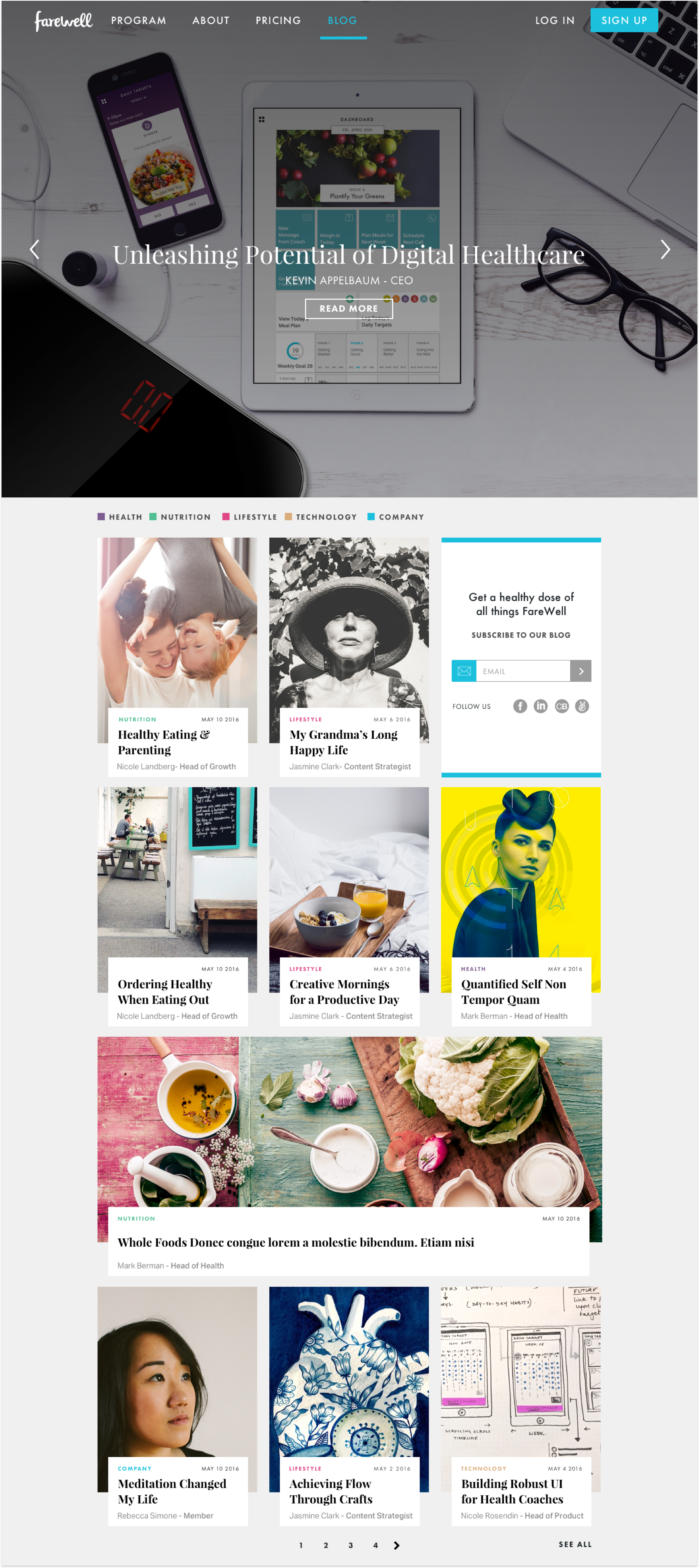
CUSTOMIZED CMS & BLOG


KEY ANCHOR 04
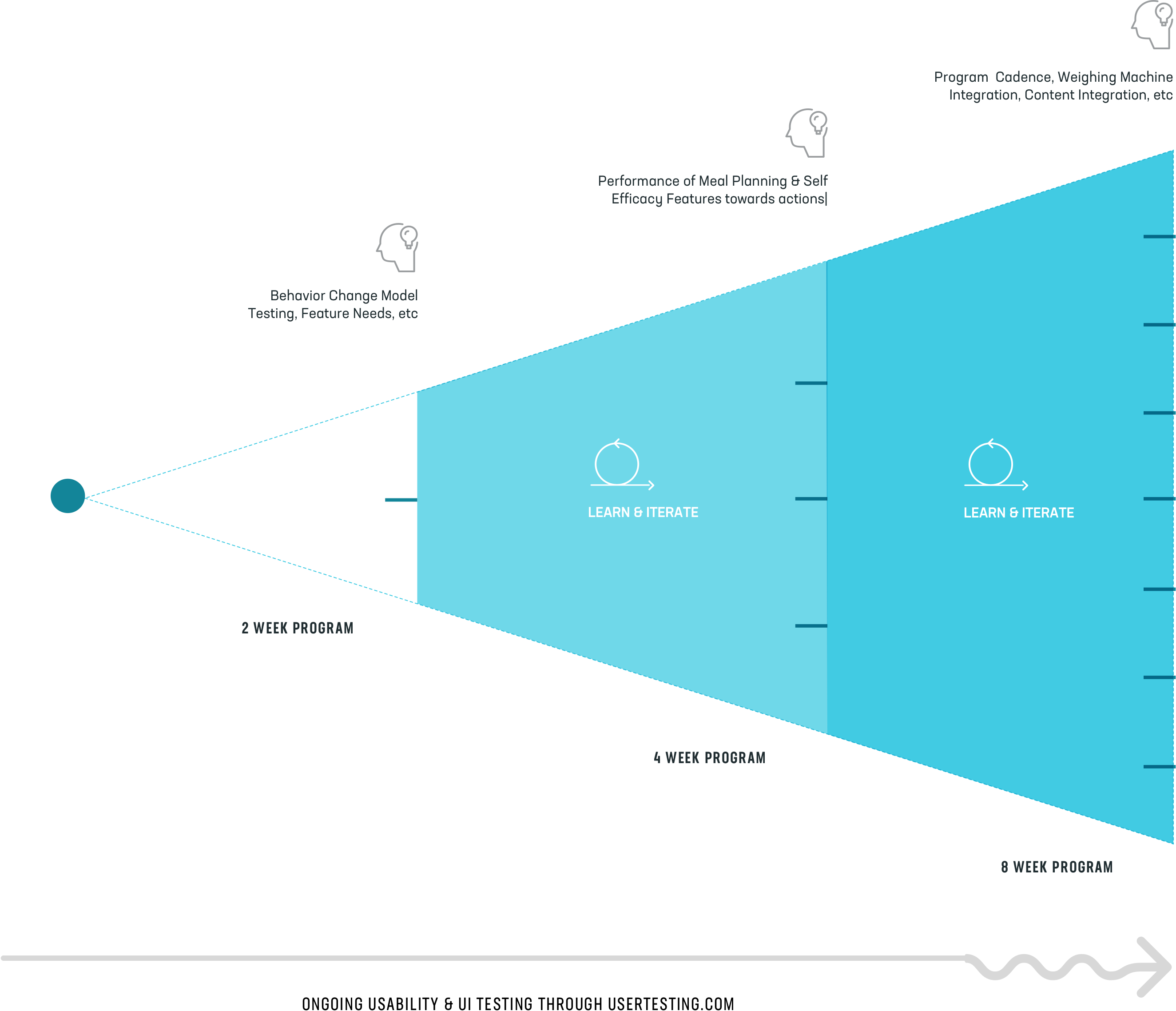
Developing Testing Programs for Collecting Improving Health Results & Service Offering
Incremental approach to learning and changing the service offereings over a period of time. In the beginniong the objectives of testing were very high level conceptual assumptions. As we progressed more and more into feature development, we also started testing the delivery offerings of coach support and cadence. We also learnt a ton about the frequency of engagement that the users should have with the coaches.

PROCESS 01
Establishing
User Persona
In order to orient product development work in the right direction, we wanted to solidify the user persona as much as we could based on our initial research. Susan is a female in her fifties and her goal is to lose weight and look better/feel better about herself.
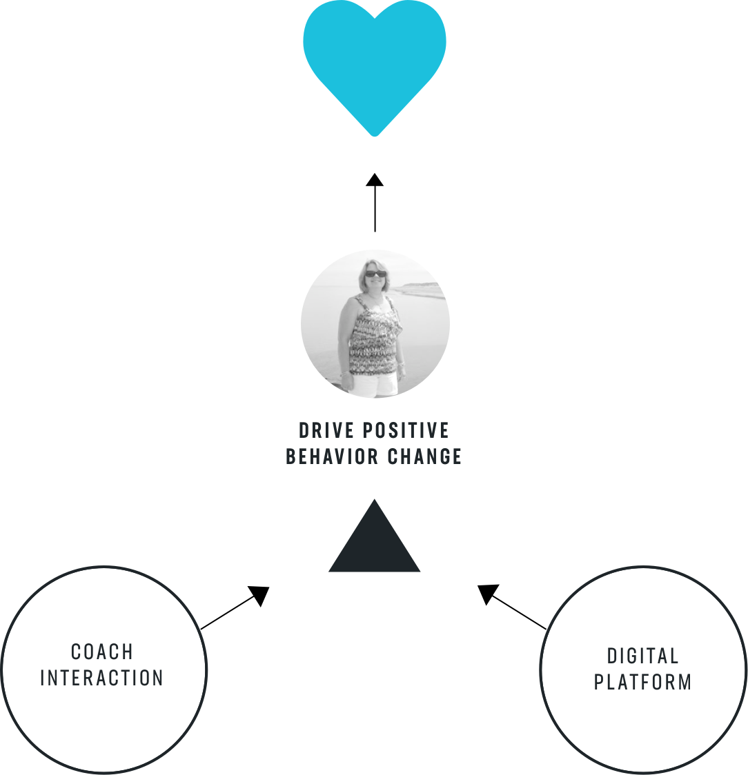
ATTITUDES & BEHAVIORS
- She has a love/hate relationship with food
- She struggles with weight
- She has tried other diets and spent money with not so sustainable results
- She wants to feel better
- She makes dinner for herself and family on most nights.
- She's disciplined and can exercise self- control in her personal and professional life, but impulsive with her dietary behaviors

DIGITAL EXPERIENCES/BEHAVIORS
- She's never withour her smart phone.
- Uses various apps like Facebook, Pinterest, Yelp and other utility apps.
- Though familiar with technology, she's not that technology savvy as the millenials
- Hidden gestures and other non-guided UI functionality is not well understood


PROCESS 02
Feature DEFINITION &
Wireframing
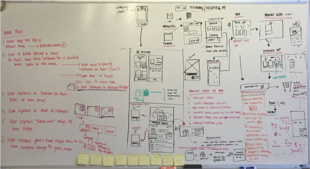
The testing funnel enabled us to approach features one by one. Always working towards the MVP for the next phase. The approach to designing each feature entailed thinking long-term but feeding development in a way that we could test the idea without building the full blown feature set. Each feature was first discussed with the advisory experts on board (health, culinary, behavioral pyschology) before drawing out the wireframes.
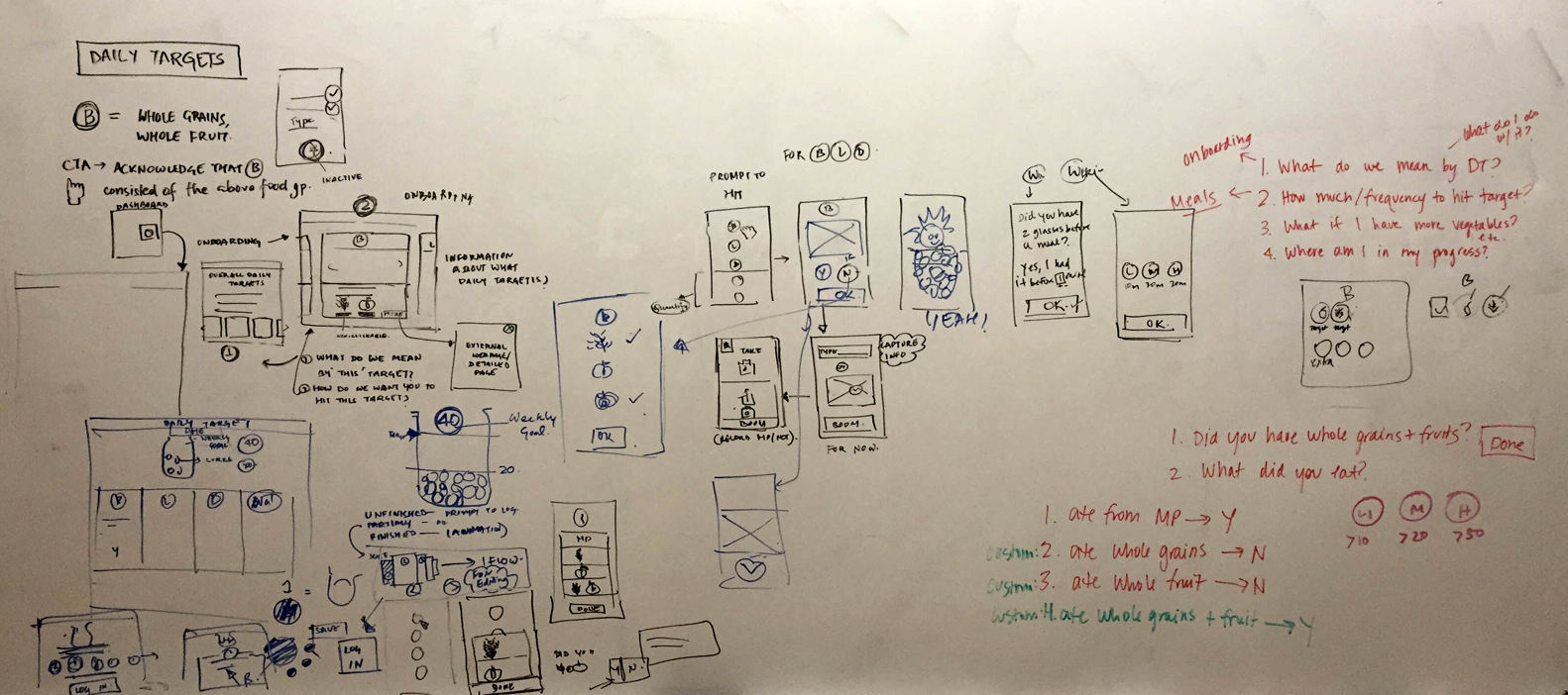
DAILY TARGETS
A mechanism to build efficacy and to receieve feedback from the users.




PROCESS 03
Establishing a Visual
Design Language
TThe CJM sets the bar high with content, and thankfully there's no shortage of it. The challenge was creating a UI framework that could stretch across content types and themes and continue to evolve. Working side-by-side, Carbon Five designers and developers created a dynamic set of layout modules and a rational system to ensure new pages always felt fresh.
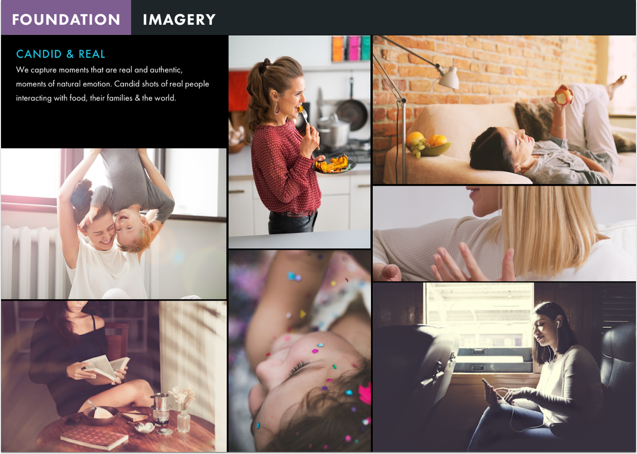
CANDID & REAL
We capture moments that are real and authentic, moments of natural emotion. Candid shots of real people interacting with food, their families & the world.

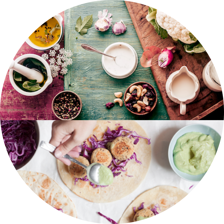
YUMMY
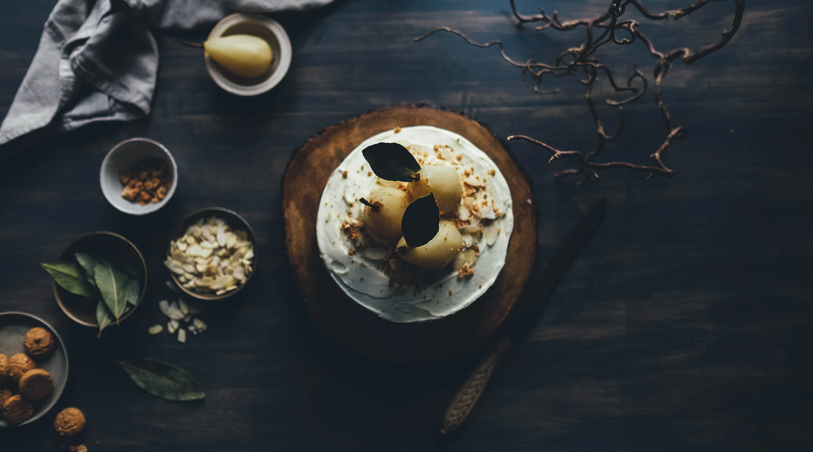
A visual treatment that speaks to the beauty that lies in food. To inspire members to percieve food as a vehicle for long-term change and happiness. Images should evoke a sense of abundance; lots of color, variety & well presented food. Inspiring Susan to love healthy food & cook more.
IMAGES + VIDEOS
Vibrant pictures of people & food that is relatable for Susan.


TRACES OF GOOD LIFE
Instead of relying on hyper-aspirational, almost unreal life situations. We love to show how you can really 'feel' a happy healthy life through your body. Bringing forth images of tangible experienes that one can breathe, touch and live.
ICONOGRAPHY
Minimal thin clean lines, easy to recognize established icons.


COLORS
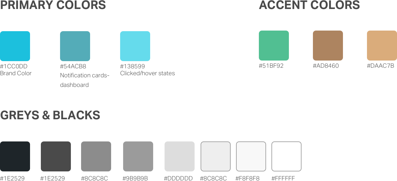
Modern colors related to healthcare. Solid color blocking. Accent colors for certain feature sets like daily targets

TYPOGRAPHY
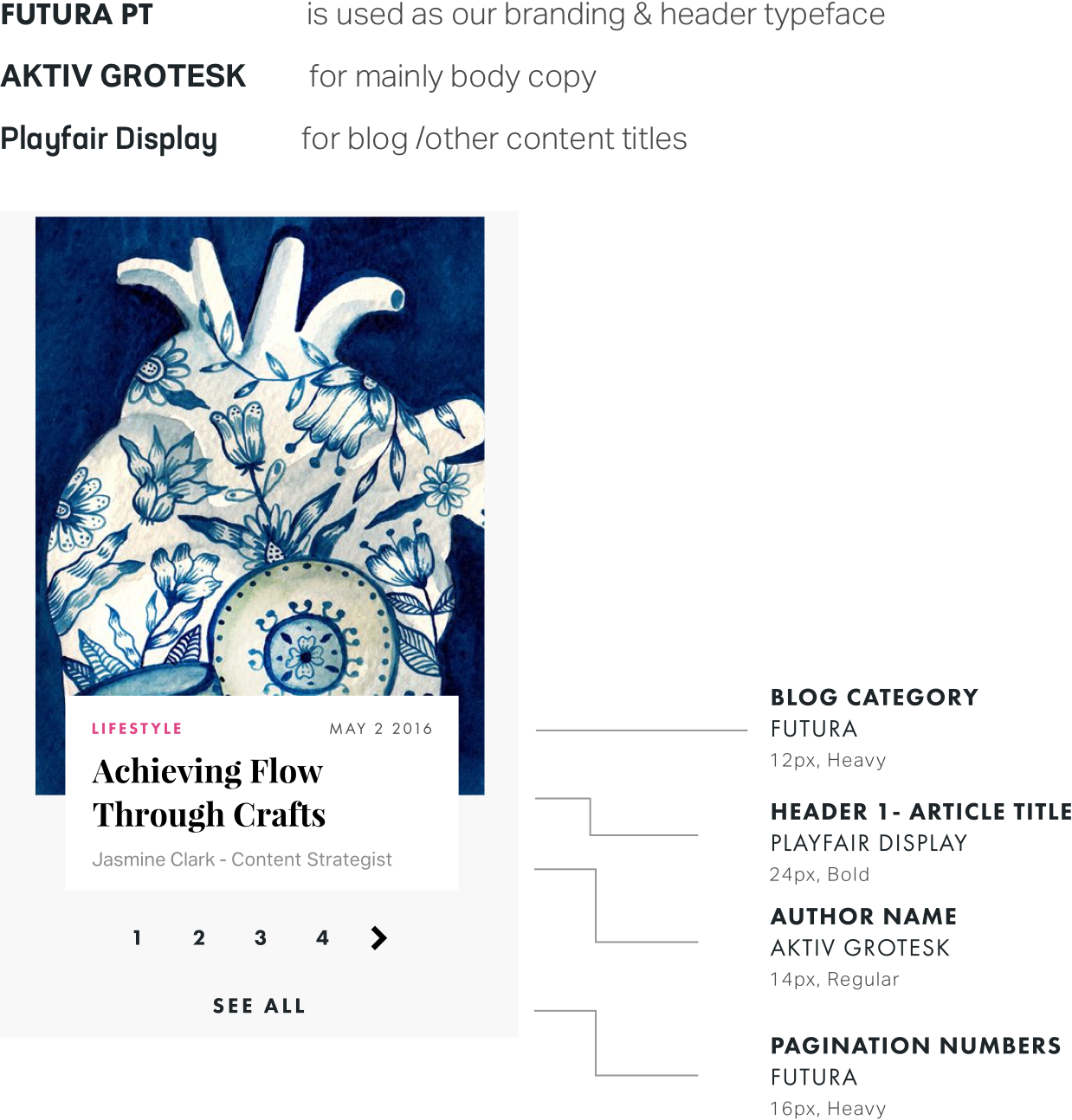
Modern typography set towards achieving legibility & clear hierarchy

DESIGNING FOR TOUCH
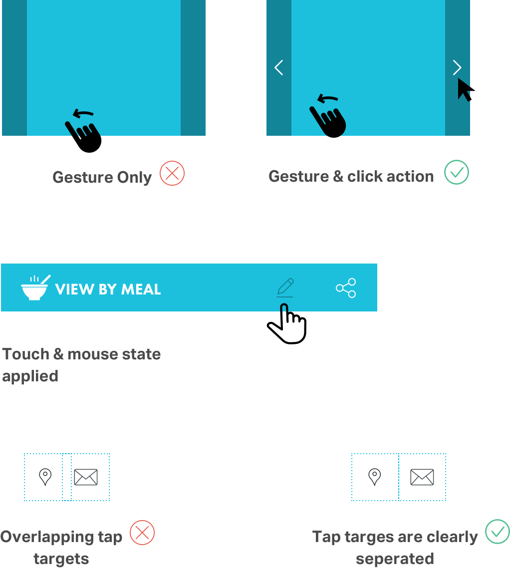
All targets should be the right size for touch. Avoiding hidden gestures. Leaning towards providing as much user interaction feedback as possible through notifications/ animations. Clear Call to Action per page to support user flow in the best possible manner.

ANIMATION
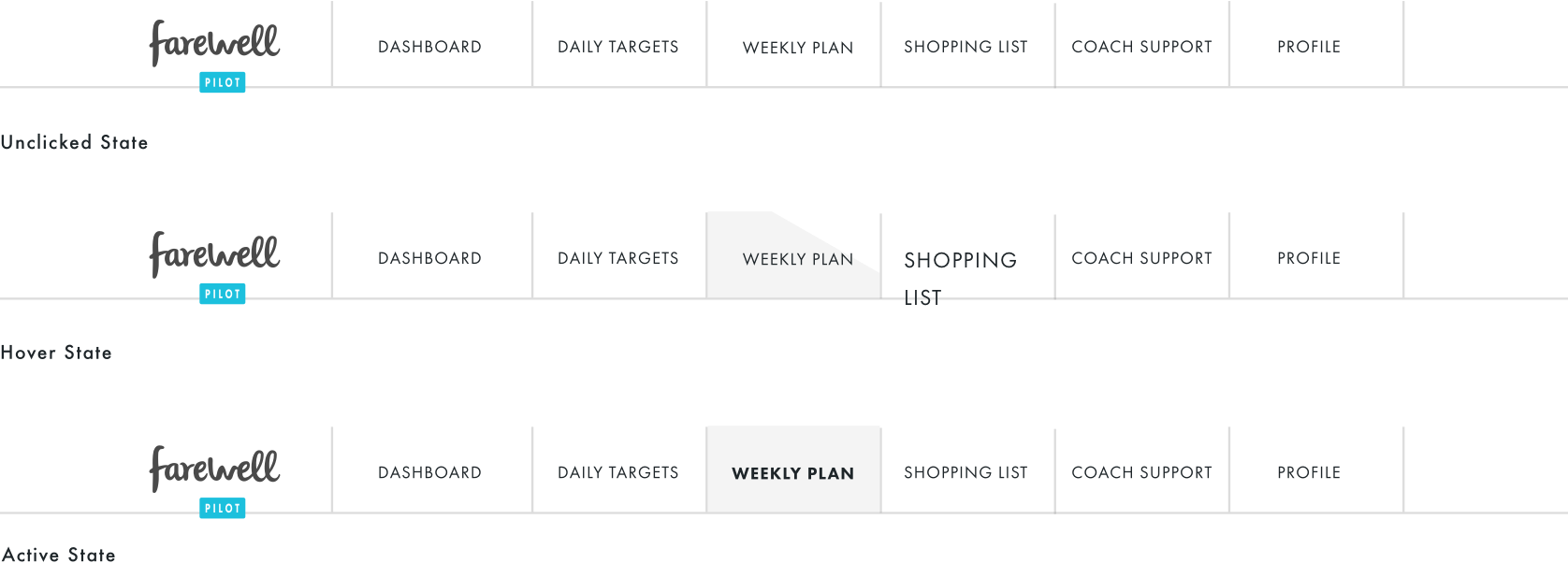
All targets should be the right size for touch. Avoiding hidden gestures. Leaning towards providing as much user interaction feedback as possible through notifications/ animations. Clear Call to Action per page to support user flow in the best possible manner.


PROCESS 04
Delivering Experience Guidelines
for Best Practices
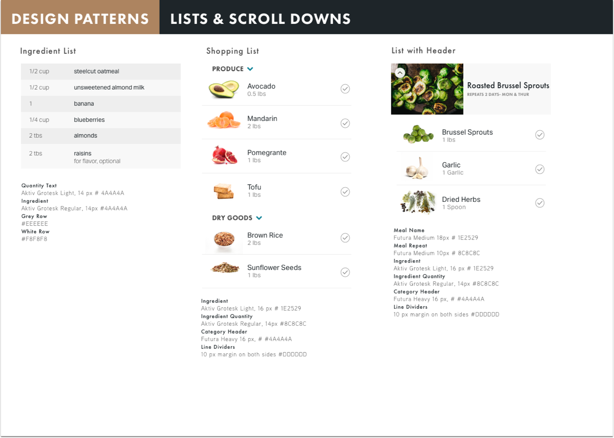
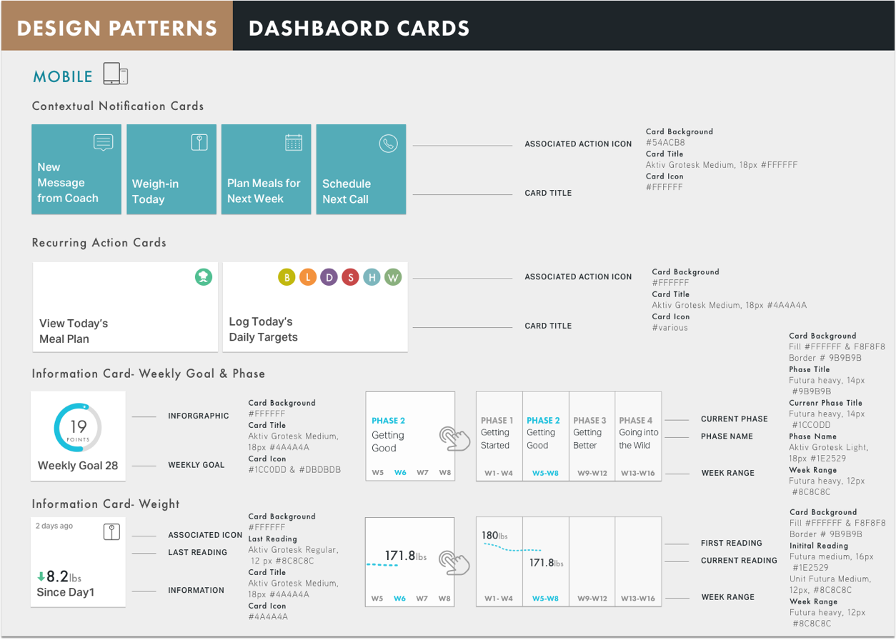
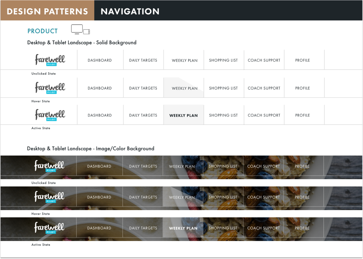
In order to make sure that the design remains consistent even after the completion of the project, a digital guidelines document was created. It listed every icon, every UI element that could be easity copied and pasted for the accurate size and styling requirements. A detailed account of the philosophy of the design was also presented.
CREDITS
THE CJM TEAM
Linda Butler, Director of Marketing Julie Davis, Digital Communication Lori Starr, Executive Director
carbonfive team
Sean Durham, Tech Lead Anna Neyzberg, Developer Treyce Meredith, Junior Designer David Hendee, Account Manager
