VIEW SITE
View EXPERIENCE GUIDELINES
PROJECT
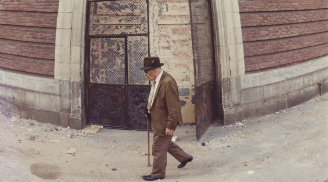
Envisioning a new digital ecosystem for The Contemporary Jewish Museum (CJM) that pushes cultural boundaries while being effortless to use on both web and mobile devices. Offering an entirely new custome designed content management solution to suit the needs of an art organization like the CJM.
ROLE
1. Identity design
2. Digital product experience
3. Creative direction
Increase traffic to the website and to the museum itself. Convert website visitors to museum visitors. Increase membership base and deepen member engagement. Serve remote visitors with institutional knowledge.
Updating dated perceptions by celebrating Jewish culutre and heritage in the modern context. Cross functional collaboration between different departments at the CJM. Customizee CMS to serve the specific needs of the museum & exhibitions. Rigorous testing to validate product & nomenclature assumptions.
Overall visitors increased for both digital and physical touchpoints. Increased web traffic on mobile from 40% to 80%. Increased membership in the more economically viable tiers and for younger people. Built a digital library to offer art and resoursers internationally.
HOME

KEY ANCHOR 01
Subtle Cues Changing Dated Perceptions
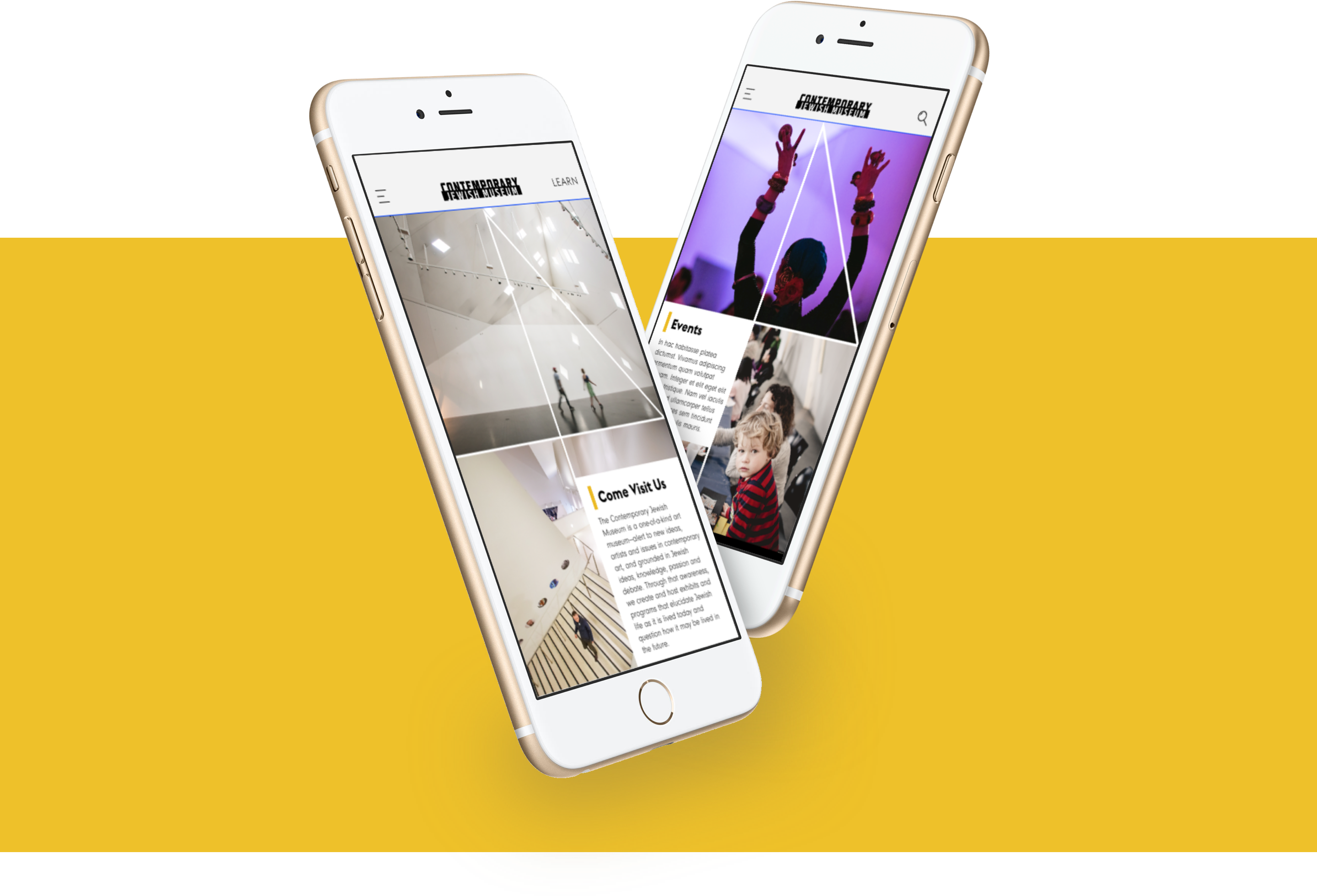
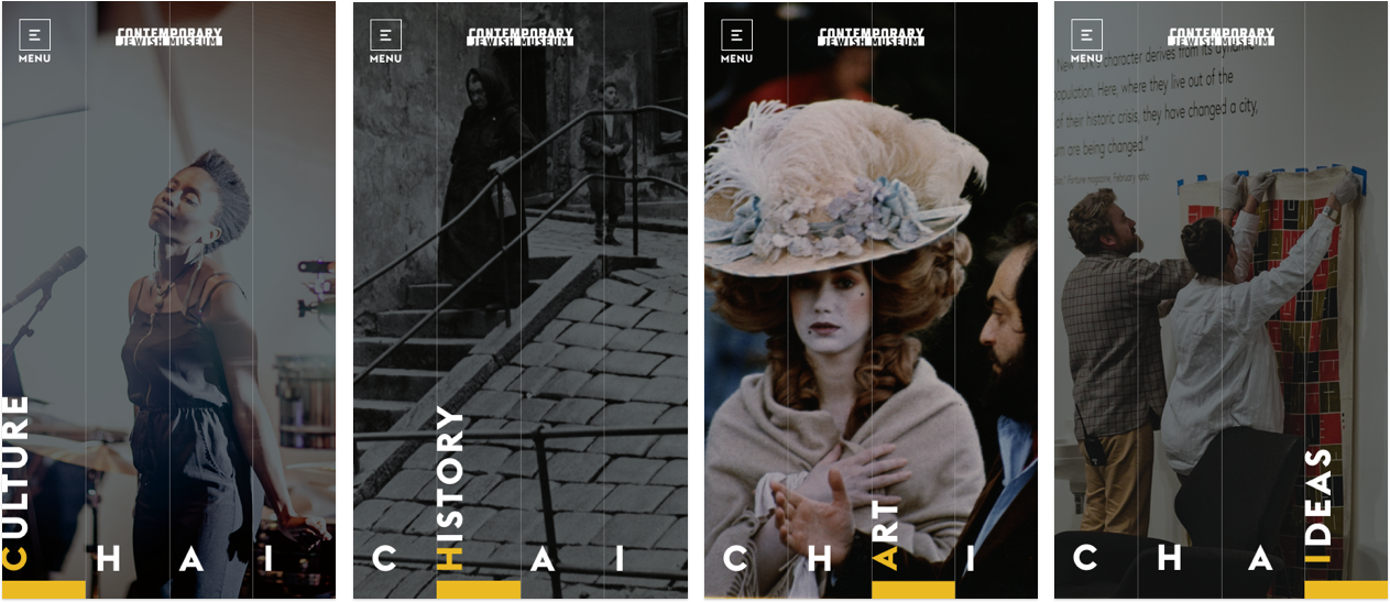
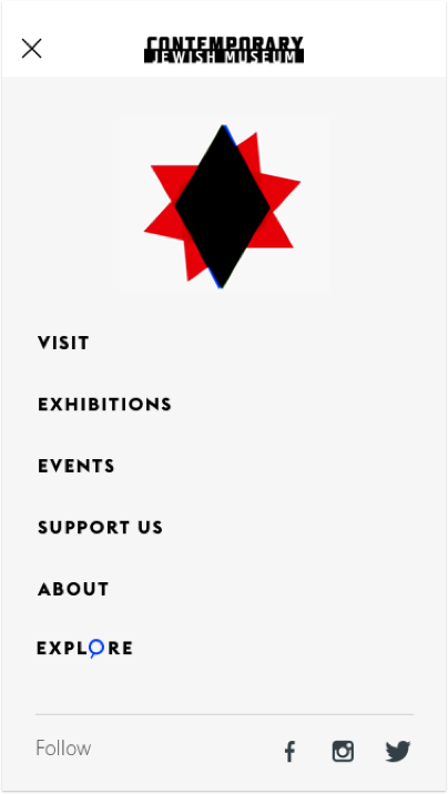
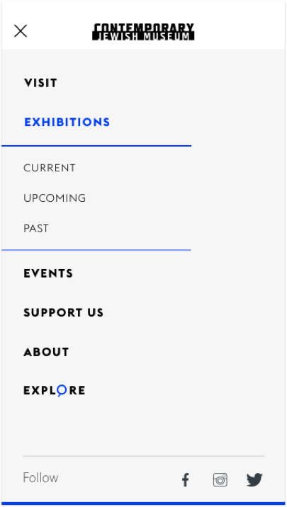
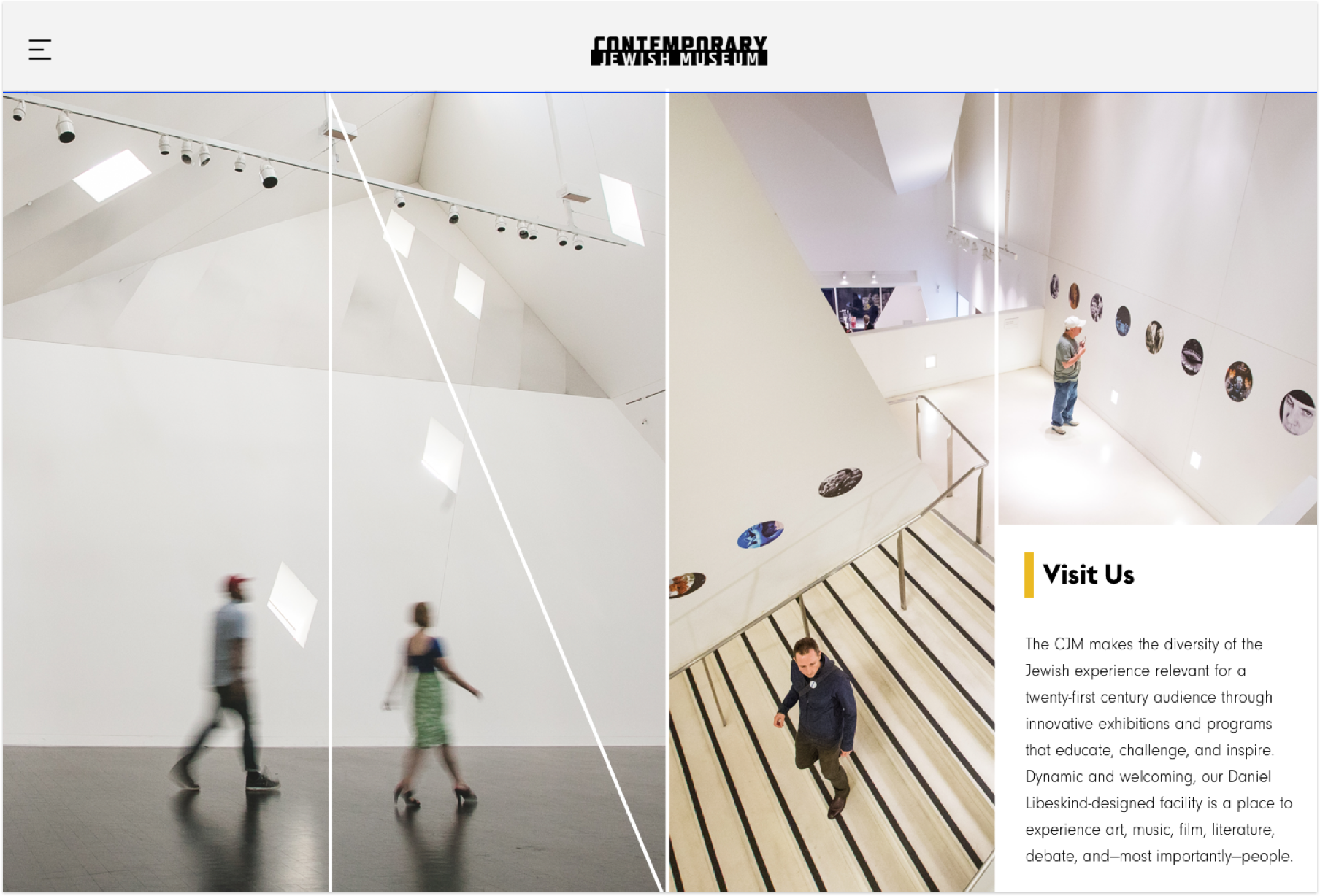
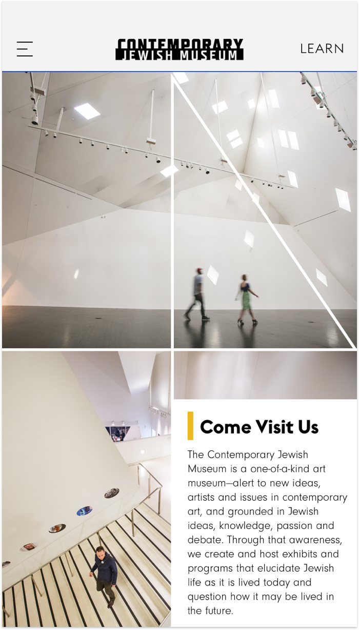
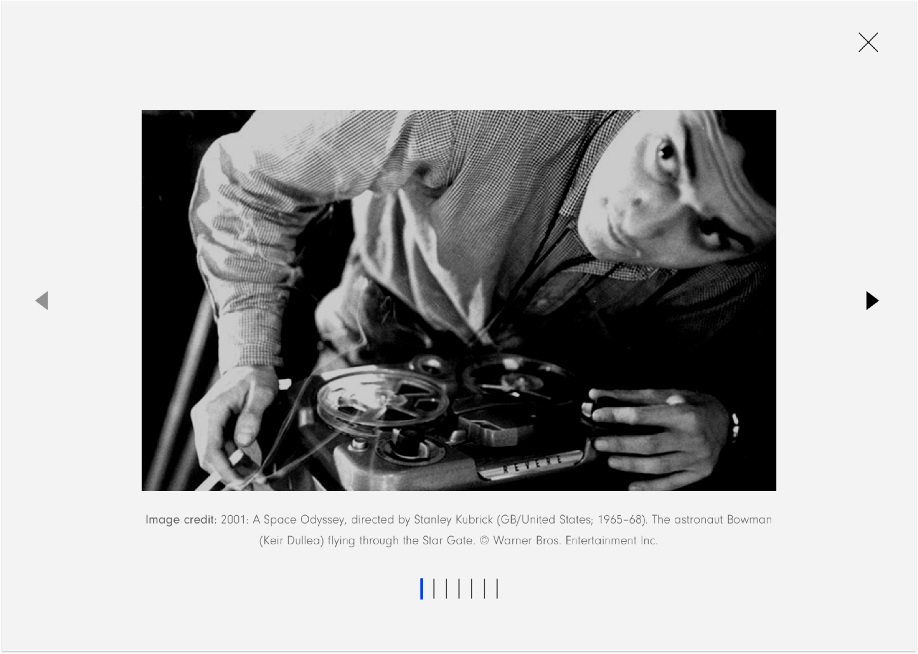
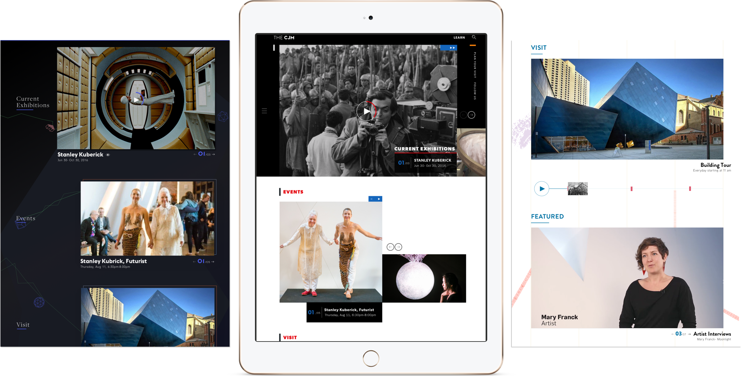
The CJM desired an updated & modern digital experience to challenge prevailing perceptions about Jewish museums. For instance, the design of the CJM's navigational elements emerged as a way to subtly reinforce the richness of Jewish identity. At the same time, the geometric shapes, vivid color story, and strategic animations play to energize website visitors and reframe their perceptions.


VISIT
EXHIBITIONS


KEY ANCHOR 02
MEANINGFUL ENGAGEMENT WITH THE LOCAL COMMUNITY THROUGH EVENTS & PROGRAMS
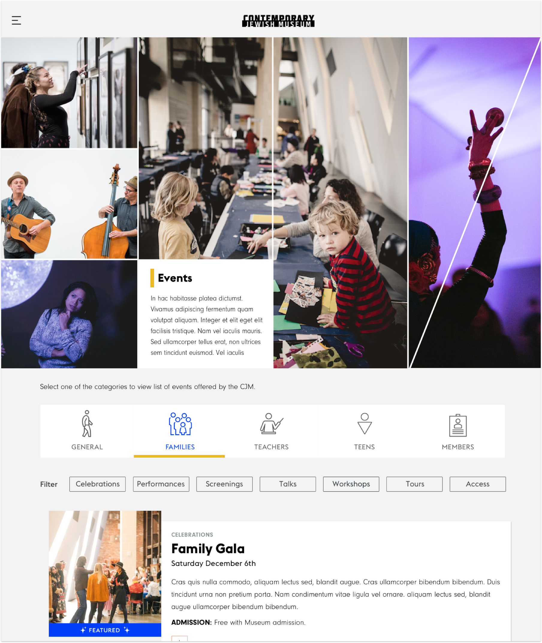
The CJM's programs and events are quite celebrated by the local community and it ignites tremendous amount of participation. With the previous website, it was very challenging for the users to find a relevant event/ program in the desired interest space for them. Through rigorous testing, we implemented updated name for the section as 'Programs & Events' and also created an interaction system though which they could filter the numerous events based on what they are looking for.
programs & events


KEY ANCHOR 03
OFFERING DIGITAL RESOURCE & MEDIA LIBRARY TO SERVE PATRONS REMOTELY
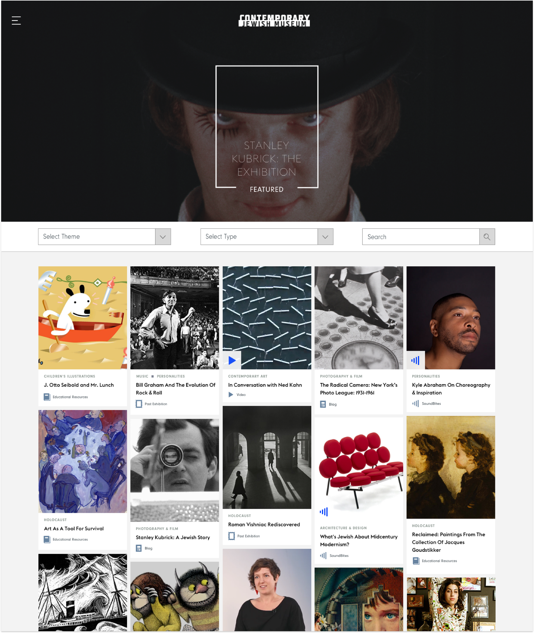
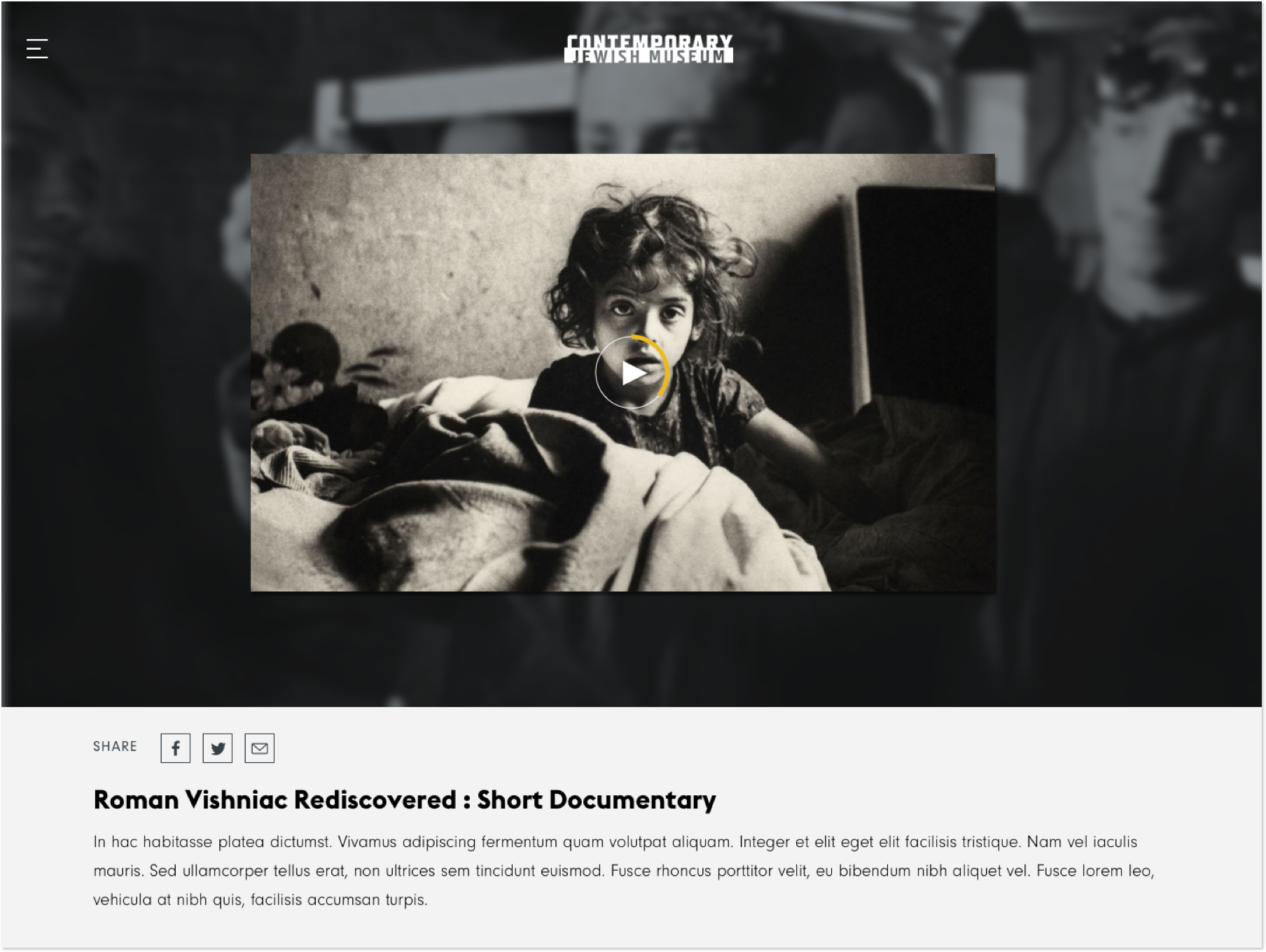
The CJM doesn't host a permanent collection and because of that the curatorial department pays a lot of attention in documenting the past exhibitions , journals and other resources in an impeccable manner. One of the institutional purpose that the museum has is to serve remote users who can't physically view the exhibits. This organization plays a key role in celebrating jewish heritage in the context of contemporary art. A mission that would not be served well if there wasn't a way for users to access resources in an easy seamless way. The structure was decided after a lot of stakeholder meetings where each department's domentation and resourcing needs were consolidated into this one large digital library.
EXPLORE


KEY ANCHOR 04
An Elastic Content Management Framework
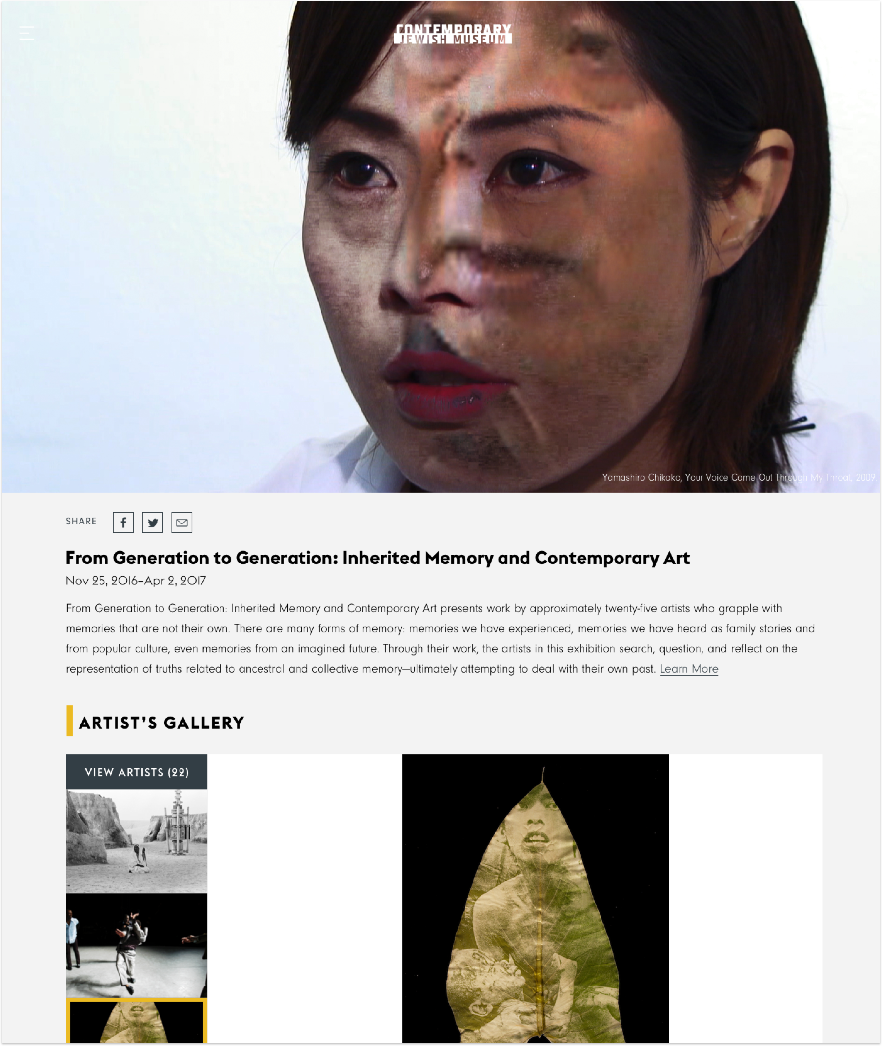
The CJM sets the bar high with content, and thankfully there's no shortage of it. The challenge was creating a UI framework that could stretch across content types and themes and continue to evolve. Working side-by-side, Carbon Five designers and developers created a dynamic set of layout modules and a rational system to ensure new pages always felt fresh.
a.
MODULAR UI DESIGN SYSTEM- GUIDING PRINCIPLES
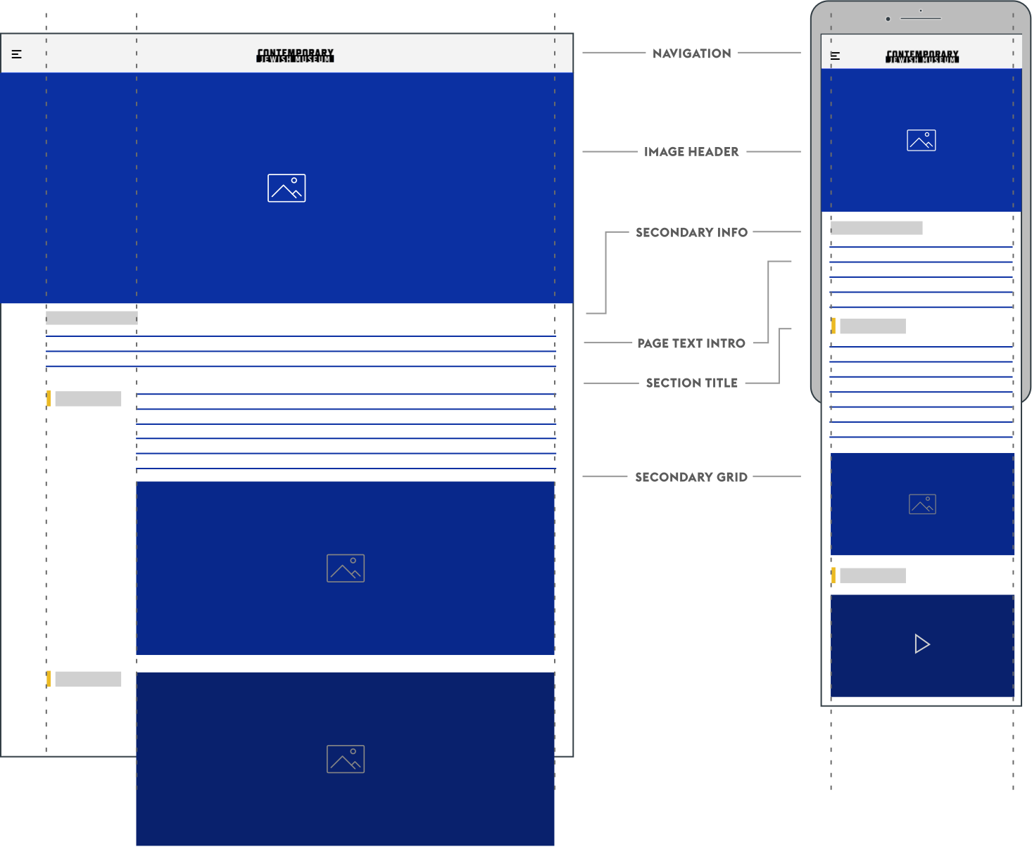
INTUITIVE CONTENT DISCOVERY
This website is designed to provide an immersive, highly visual experience. Different modules & UI elements are geared to present a comprehensive, digetible list of items to enable easy browsing & discovery.
UPHOLDING READAILITY & VISUAL HARMONY
Modules are created in a way that would provide a simple toolkit to organize content in a comprehensible way. The prime objective is to present information in an intuitive way, upholding readablity and clear visual hierarchy. The 'section titles' also provide a cohenrent way to organize differnet content buckets.

MAINTAINING VISUAL CONSISTENCY
This system is guided by design elements like typography, consistent baseline grid layout, space, color and imagery. This creates hierarchy, meaning and focus that immerse the user in the content fully. These elements encourage consistency by virtue of repetition across different browsers and screen sizes.

b.
EXPRESSIVE SYSYEM OF MODULES FOR EACH PAGE DESIGN
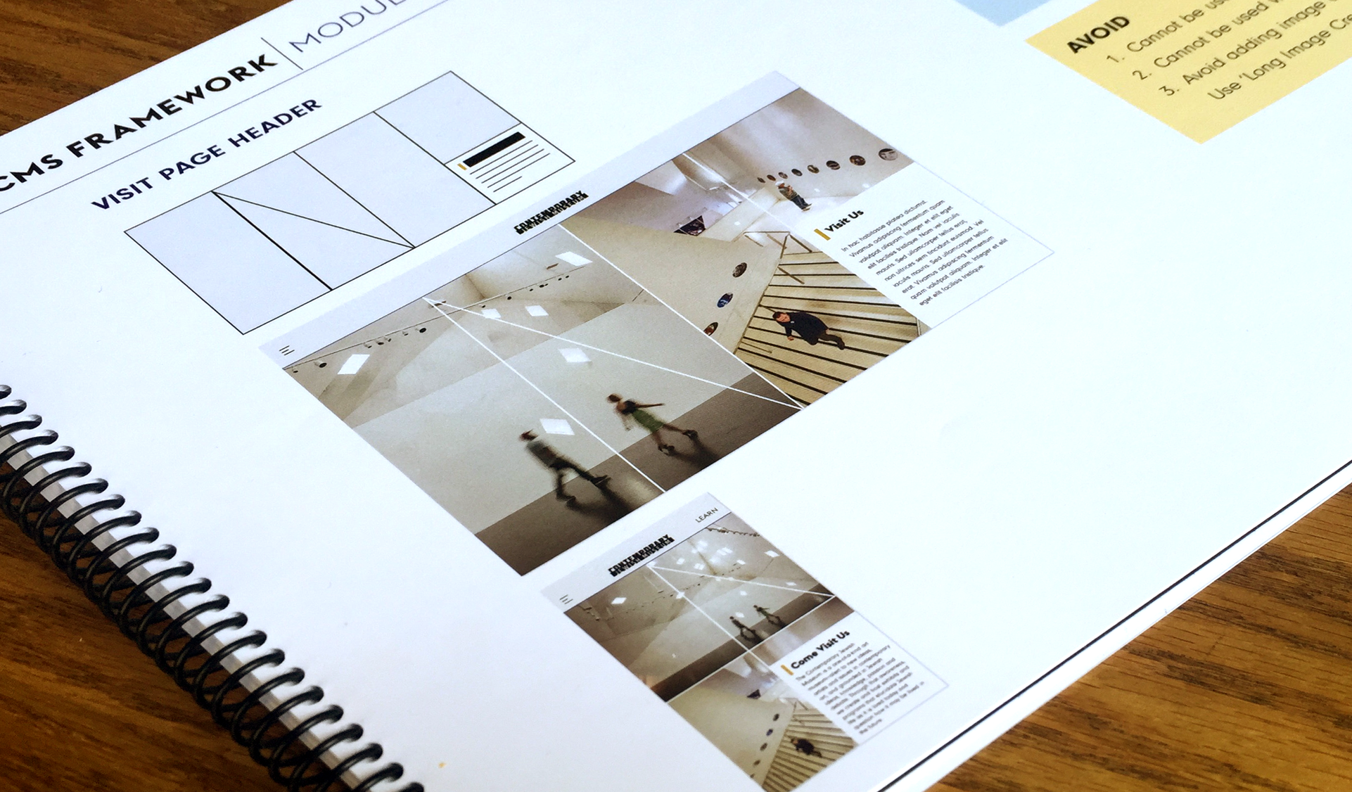
Develop an underlying design system that allows for a unified experience across platforms and devices. Each UI element was thought of as a building block (a lego) in order to create pages that appeared unique but yet visually consistent with the overall design aesthetics. An extensive style guideline handbook was provided for the CJM team to follow best practices for page creation and content management. The document outlines different page types and its relevant module configuration. Best practices for page creation, section creation and module choice for specific type of content usage. Deeper understanding of different modules and their preferred content use cases.
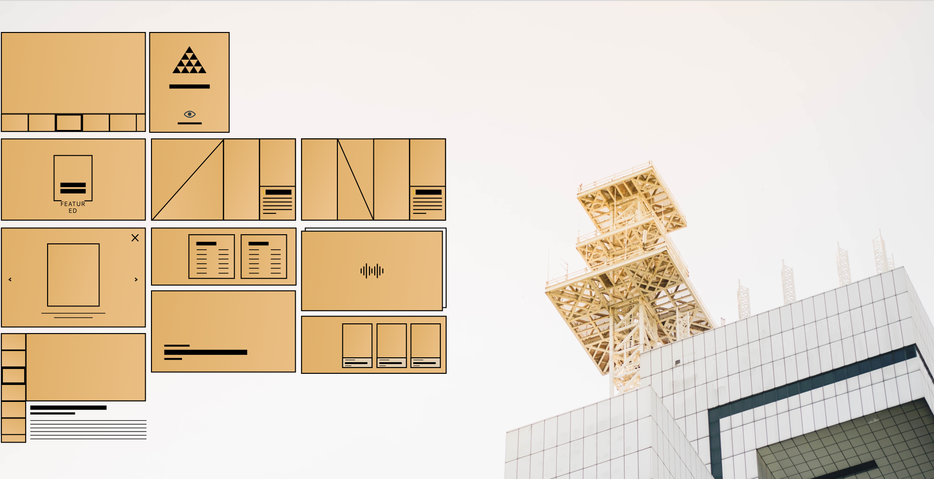
INDIVIDUAL MODULES
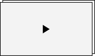
Each module is a tool in the CMS that translates to a single UI element represented on the website. There are a total of 37 modules.
SECTIONS
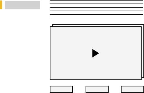
Sections enable hierarchy and content categorization. ‘Section Title’ acts as a header- an introduction to the content. It also combines multiple modules to create different assortments of content types.
PAGES
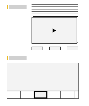
Multiple sections create a webpage. There are essentially 3 kinds of pages that follow their own set of rules for differentiation.- Main Pages, Content Pages & Secondary Pages.
c.
USER FRIENDLY UI ADMIN TO CREATE CONTENT WITH EASE & FLEXIBILITY
In many of the CMS frameworks, most pages end up looking the same because of fixed templates. In order to take a greater expressive control, the admin has to get into the HTML and deeper code. This CMS framework was fundamentally designed to give expressive control without having to get into the technical weeds. The CMS framework enables a non- technical user to create, manage and edit webpages with ease and flexibility.
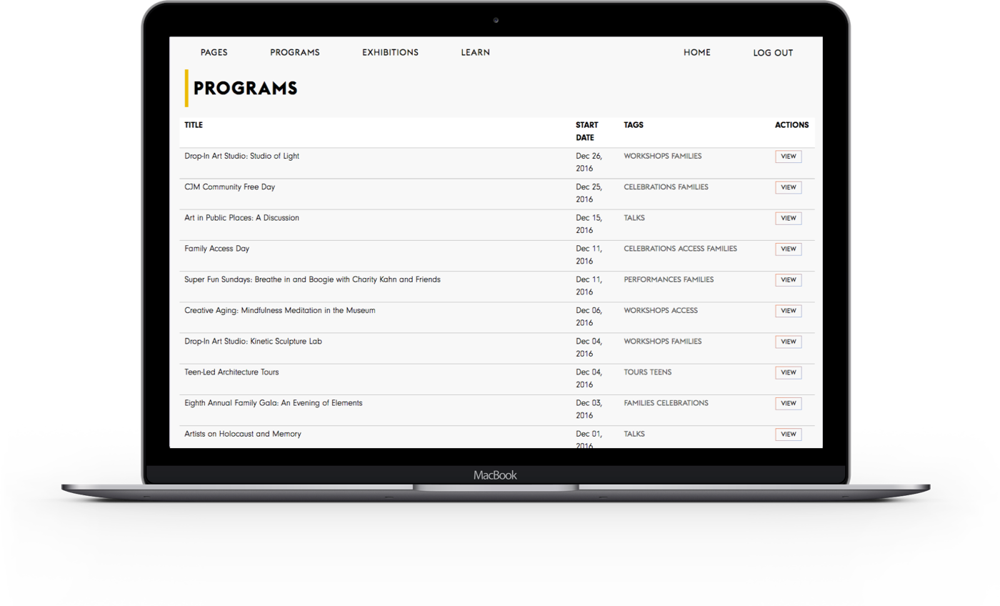
CREATE & MANAGE NEW PAGES
Different page types were created in the code based on the content requirements. This system Modular design-code frame-work would enable CJM to actively maintain, create and customize content.
EXPRESSIVE CMS UI
Extensive list of curated modules served to the admin to create specific pages. Various module choices make it really easy and interesting to create unique pages that still look visually consistent.


PROCESS 01
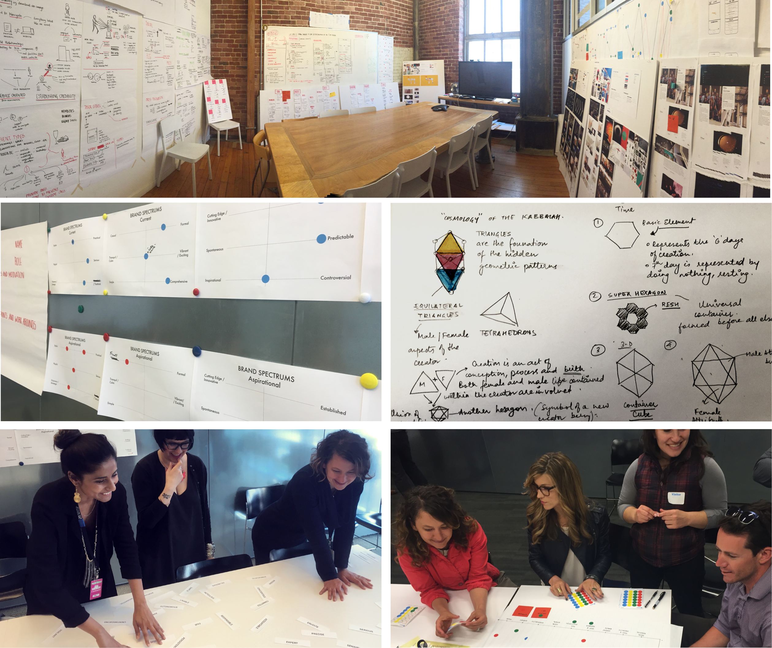
Building the Brand Framework & Doing Stakeholder Interviews
The CJM sets the bar high with content, and thankfully there’s no shortage of it. The CJM brand faces a perceptional barrier. This institution celebrates contemporary art that is embedded in the fabric of jewish heritage. Our design team worked on lending a brand language for the CJM that updated its brand message through modern minimal experience language. And also presenting the institution in a new light where its staff, community and educational efforts are brought to the front and centre of its brand messaging.

PROCESS 02
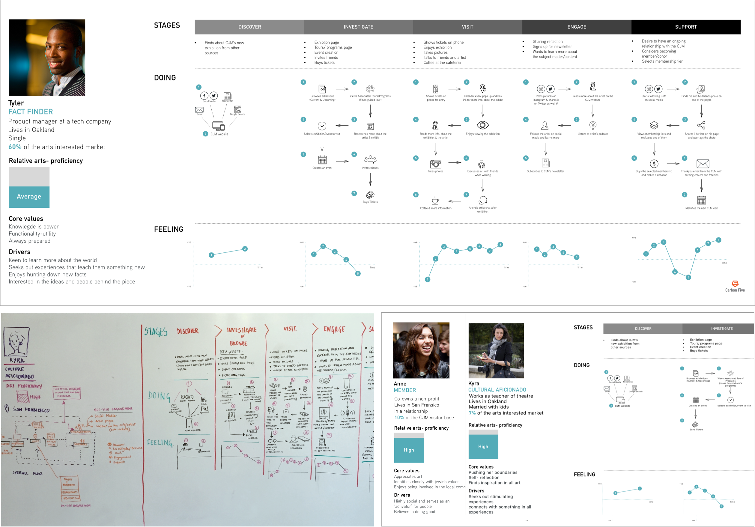
Crafting User Joureys & Personas
The design process entailed a deeper dive into the overall musuem experience, even outside of the digital realm. We studied the pattern of visitor navigation in the museum and started working on creating a digital experience that was an extension of the museum experience. Personas and journey map exercises allowed us to externalize those experiences through the lense of a real user. We referenced a research study that was done before our engagement.

PROCESS 03
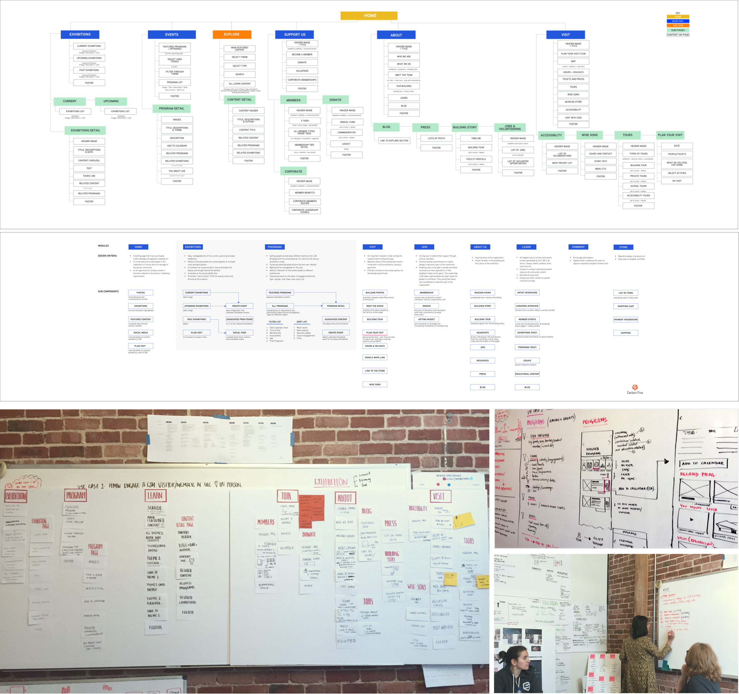
Designing Information Architecture & Site Map
Allocating the easiest way to find the relevant content that the user is looking for was very important for the CJM. There are many different departments in a museum that have very distinct offerings like curatorial, education, programs, marketing, etc. Each department page was a mini website to offer information, stimuate user engagement and maintain relationships. It became extremely important to test out different ways of laying out important pages and all other secondary pages. The system was designed in such a way that cross pollination could be enabled across exhbition pages, relevant events and education program pages, etc. A lot of paper prototyping exercises were faciliated to enable the clients to visualize the overall structure.

PROCESS 04
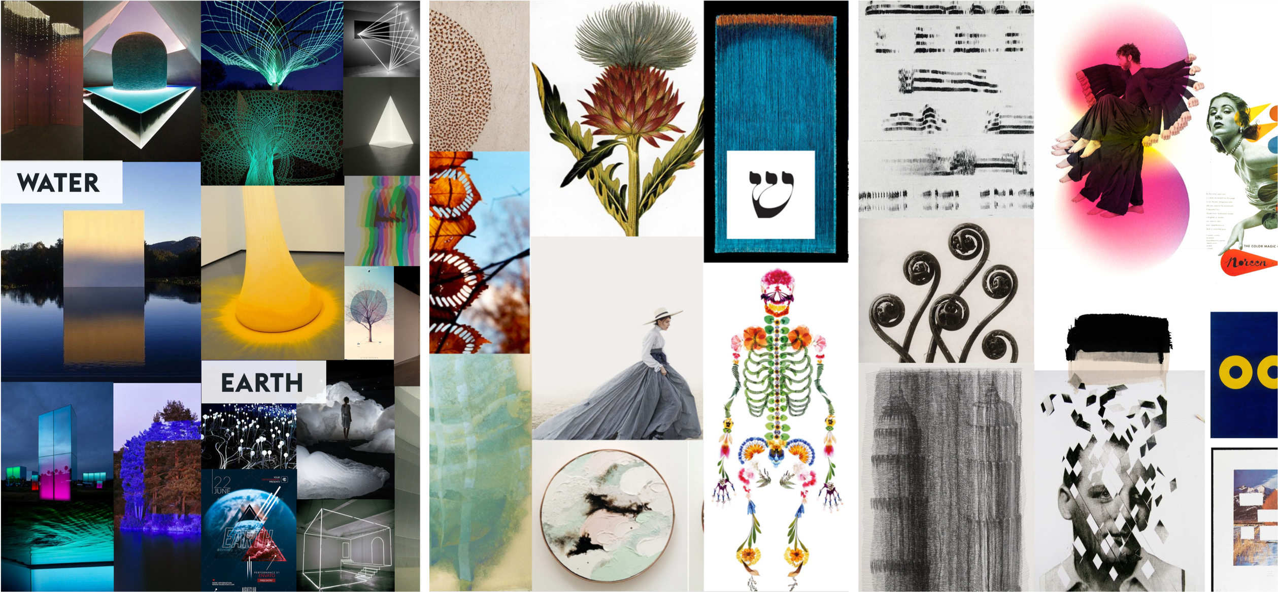
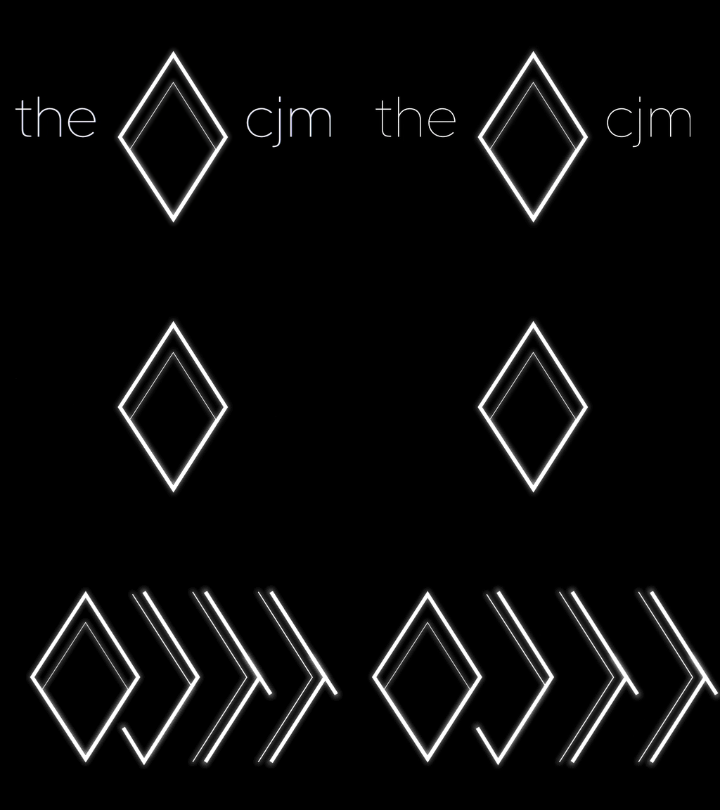
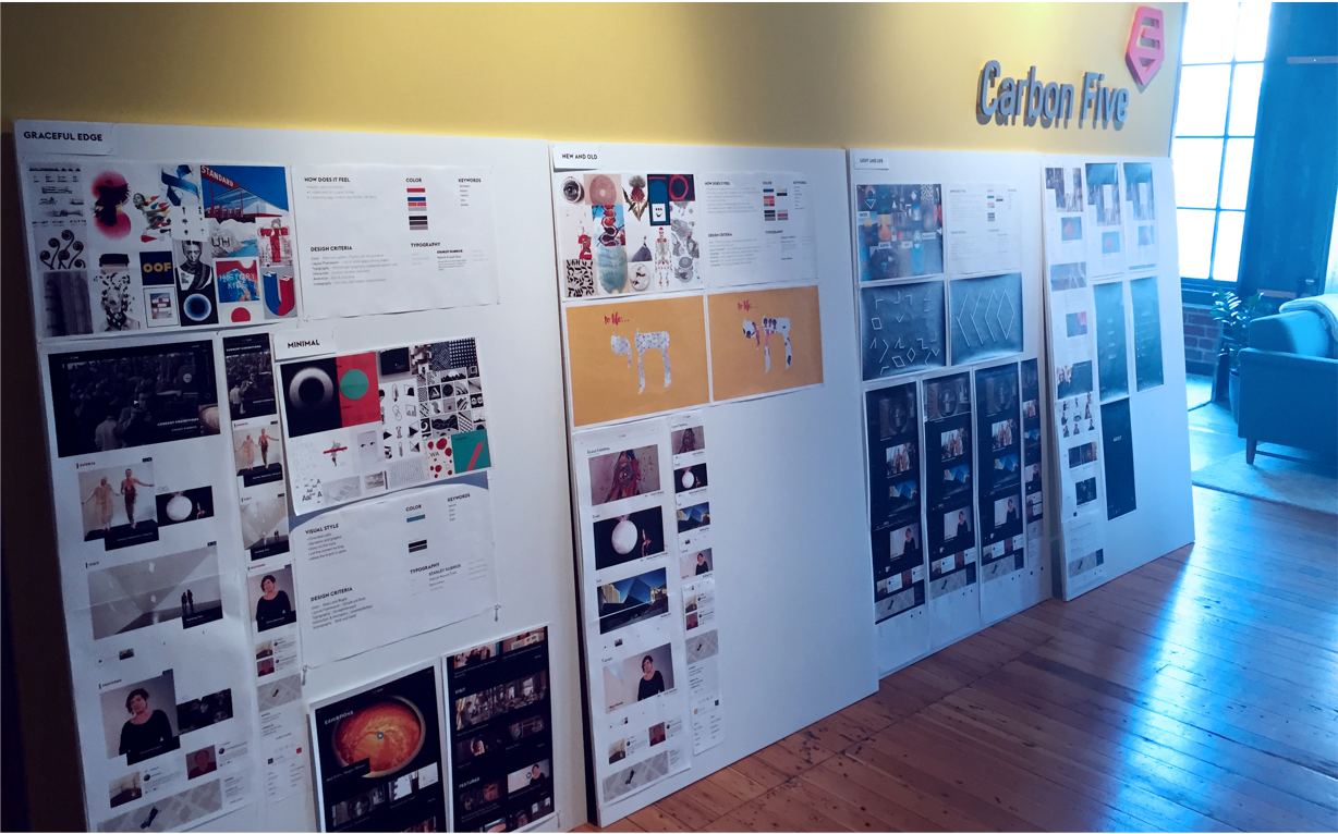
Establishing a Visual Design Language
The challenge was creating a UI framework that could stretch across content types and themes and continues to evolve. Working side-by-side, Carbon Five designers and developers created a dynamic set of layout modules and a rational system to ensure new pages always felt fresh. There was a systematic library of modules that were designed keeping the myriad cases in mind. Besides the breadth of devices and use cases, the visual design approch was also highly emotive in its quality. This was an effective tool to manifest the brand positioning and pillars that we had identified in the beginning of the project.
VISUAL CONCEPT EXPLORATIONS
CONCEPT MOODBOARDS


PROCESS 05
Learning & Iterating Through User Testing
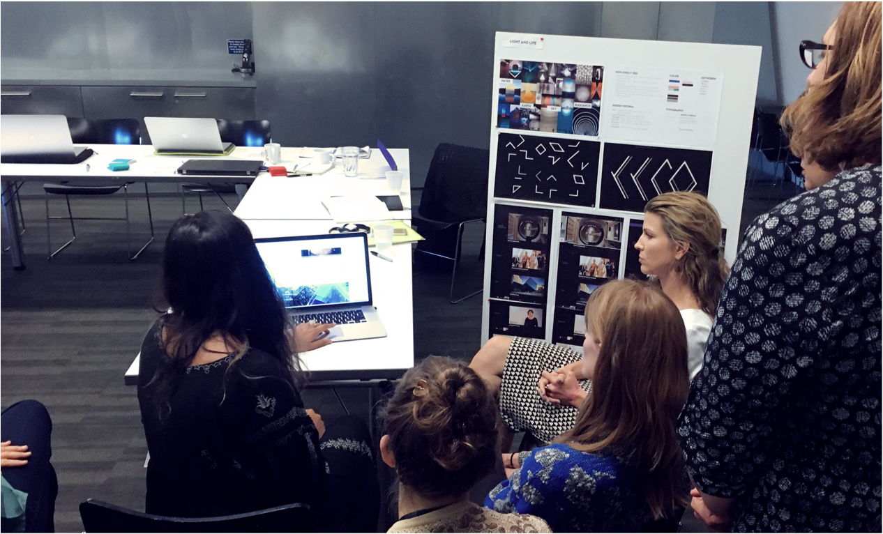
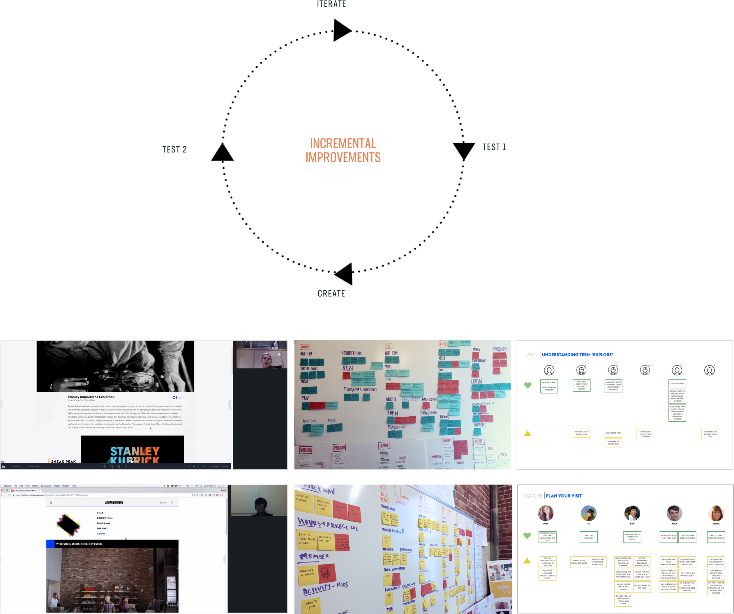
We went through two phases of usability testing. There were periodical testing done to test nomenclature, oganization and usability. These provided us with a framework to address a lot of conflicting ideas about domains and nomenclature. We successfully built consensus across 6-7 teams at the CJM. We did these tests in 45-90 minute in person interviews and facilitated task based user testing. We primarily tested with a clickable prototype. Data was collected via video and a rainbow spreadsheet.

PROCESS 06
Delivering Experience Guidelines for Best Practices
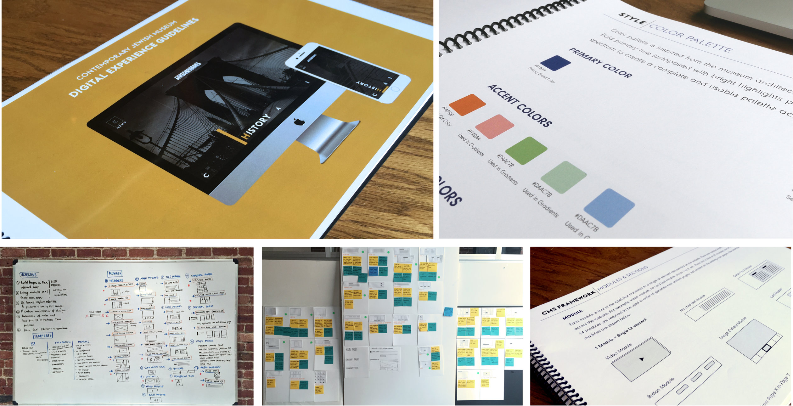
To ensure the long term success of design, an extensive digital experience guideline handbook was provided for the CJM team. It offers a comprehensive way to carry the ethos of the design methodology employed. The contents of this handbook stretched from the thematic inspiration, visual style guide to a detailed spec of all UI elements. But most importantly, it presents a systematic approach for content creators to follow best practices for page creation and content management. To enable the design champion within the organization, this handbook offers different modules, page types and their preferred content use cases.
CREDITS
THE CJM TEAM
Linda Butler, Director of Marketing Julie Davis, Digital Communication Lori Starr, Executive Director
carbonfive team
Sean Durham, Tech Lead Anna Neyzberg, Developer Treyce Meredith, Junior Designer David Hendee, Account Manager
OTHER PROJECTS
 Better Therapeutics
Couchsurfing 
Packard  Foundation
 Population Services InternationalRadical
Radical  Candor
 LexInisht
Virgin  Sports
 Levis Jeans
Daqri AR 
Cordium  - Pilot
